Don’t worry, I haven’t taken leave of my senses: I’m not writing a Big Sur Diary because I’m running it on my primary Mac. But since a recent piece reminded me that I had a spare Mac sitting in a cupboard, it seemed a relatively small risk to install it on that.
One concern many have expressed over the years is the possible “iOS-sification” of macOS. In other words, with iOS (and now iPadOS) the big money spinners, that Apple might compromise the power of the Mac’s user interface in order to make it more consistent with the iPhone and iPad…
A first glance at some aspects of Big Sur might seem to confirm those fears. The visual similarity between iPadOS and macOS is a lot closer than it was. There are big things, like bringing Control Center to macOS. And smaller but still significant things, like the Messages, Maps, and Music apps now looking extremely similar to the iPadOS ones.
But I haven’t yet seen any examples of Apple reducing functionality on the Mac. As a minimalist, I’m all in favor of a simpler aesthetic, and like what Apple has done.
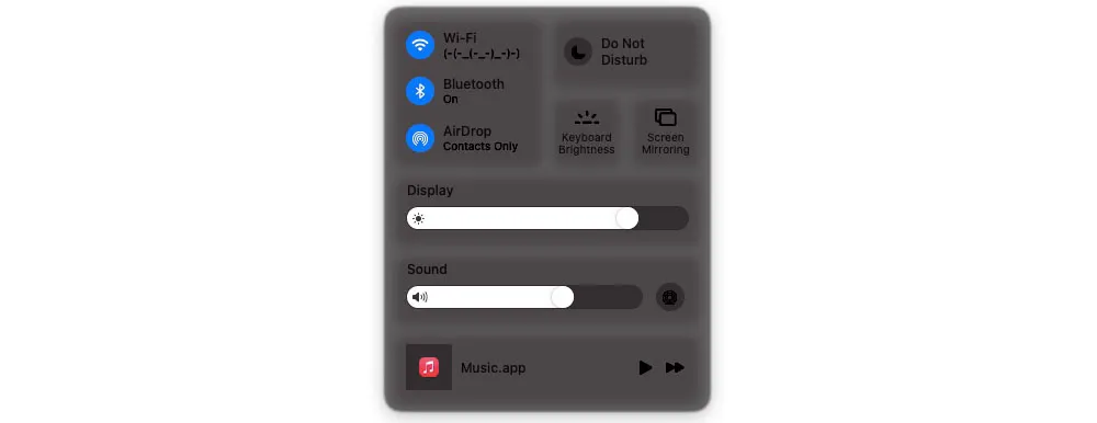
The new Control Center, for example, is great:

That doesn’t rob the Mac of any functionality – it simply makes it easier to use, by bringing together a bunch of frequently used adjustments.
I also love the way that more detailed control is just one click away. For example, click on the Display area and it opens up the full control, exactly as if you’d clicked on a standalone brightness control in the menubar.

The volume control is also a better-looking version of the Catalina version, with icons representing the different audio output devices available.

I also like the flexibility you get with the Control Center items. Want to keep a minimalist menubar by accessing these controls through a single icon? You can do that. Want immediate access to any one or more of them via standalone menubar icons? Just drag, say, the Bluetooth control to the menubar. That’s the best of both worlds.
The groupings in Notification Center is also a huge improvement.

Similarly, having your widgets beneath the grouped Notifications works really well, though, like iPadOS, these will only be truly useful once we have a lot more of them.
There are a couple of visual changes I don’t like, however. First, the menubar spacing. Icons are further apart (top) than they are in Catalina (bottom), and to me that looks visually untidy as well as being an inefficient use of space:

I have the same two objections to the much greater vertical separation between menu items.

That said, I do prefer the rounded rectangles, and I love the translucent menubar:

I also like the new icons (top):

The new system sounds are cute, though probably I’m just glad of a change there.
Apple makes much of the Safari changes; I’ll have to use my Air for some heavier-duty browsing before I can comment on those.
The only thing I absolutely so far is the ridiculousness of the permissions approach. You have to grant permission – via password, Touch ID, or Apple Watch side button – for the most innocuous of things, like moving a file between folders. It’s absolutely infuriating. But I know Apple has had a great deal of feedback about that, so that nonsense will hopefully calm down within a beta release or two.
Speaking of betas, there are of course glitches. The Messages app didn’t sync, for example, until I signed out of iCloud and signed in again. Gmail blocked access to Apple’s Mail app, labelling it a “Less secure app,” which required me to create an app-specific password for it. The Notes app also keeps crashing. But that sort of thing is to be expected at this stage.
I need to do a lot of app updating of my MacBook Air before I can comment on app compatibility, simply because it’s been some time since I last used it. I already know a few apps won’t run, but I need to test the current versions of all my main apps.
My Big Sur diary won’t be a regular one, because I don’t use the MacBook Air on anything like a regular basis. But I will get the machine updated with all my main apps, and will likely report back on that. Further updates will probably wait until the release, and perhaps a bit longer.
You can of course get the full story from our video hands-on, detailing 85+ changes.
If you’ve been using Big Sur, what are your own impressions so far? Please let us know in the comments.
Author: Ben Lovejoy
Source: 9TO5Mac


