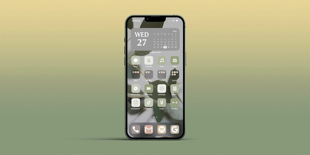
Apple doesn’t offer truly individualized customization of its products or interfaces to its users, and if anyone wants to customize the look of their Apple products – specifically their home screens – they’re in for A Time. With iOS 16 coming in September, there’s an opportunity for Apple to give consumers needed autonomy.
The only cell phones I’ve ever owned have been a Nokia (shoutout to Snake, my first love), a Blackberry, and an iPhone, none of which I’ve ever fully customized.
I’m currently on my seventh iPhone, and I’ve always accepted that my phone’s home screen simply looks how it looks. Sure, I can “edit” the home screen’s layout with apps, widgets, and folders for organization, but I’ve never been able to make it more me – you know, how Android users can make their phones more them. That all changed this week when I tried my hand at customizing my phone‘s home screen using two icon packs I purchased from Etsy.
Using this article as my reference – and also its author, my colleague Michael Potuck – I slowly became familiar with the Shortcuts app, Widgetsmith, and everything in between that is required to create a custom home screen aesthetic on my iPhone. Here’s what I had to do, which I will never do again, because it took far too long.
Choose an icon pack
First of all, the sheer number of icon packs available online is overwhelming. It’s fun for a minute to browse through options, but I quickly lost interest and patience; it’s kind of like the difference in shopping at the mall versus one independently-owned boutique.
You can find free icon packs, grab icon packs from Etsy, or create your own icon pack (though I hear this is difficult), and there are, quite literally, tens of thousands of packs to choose from. I spent about five minutes online before deciding on this icon pack for $6, and I got to work.
Download multiple zip files and PDFs
This step was where things started to hurt, even if at first, it was only a little. Using instructions from the Etsy seller, I had to download zip files and PDFs, drag them to my desktop, open them, and then open the folders that the zip file created, all of which was extremely tedious. Once I had access to the icon and widget folders, I of course had to choose which icons and widgets I wanted out of the hundreds available in the icon pack – I genuinely had no idea how bad it would get.
Copy and paste icons into Photos
I didn’t anticipate this step being so laborious, but wow was it ever. You have to cross-reference the apps you already have on your phone with the matching icons from the downloaded zip folders, and then you have to copy and paste those icons into Photos. Make sure you have iCloud syncing on, or you won’t be able to access the icons you chose on your phone.
Use Shortcuts to re-design apps
Enter: the absolute epicenter of my frustration with Apple home screen customization.
Never have I ever become so familiarized with an app in the way I have become with Shortcuts during this process, and I am certain that I’ve barely scratched the surface of everything Shortcuts can actually do.
I don’t even know where to begin.
Basically, I had to open Shortcuts, hit the + sign in the upper right-hand corner, tap “Add Action,” type “open app” in the search bar, then tap “Open App” under “Scripting,” THEN choose from a list of apps I have on my phone in order to customize one of them.
Let’s say I wanted to customize the Instagram app.
Once I’ve chosen Instagram, I had to tap three little blue lines in the upper right corner, choose “Add to Home Screen,” rename the app, pick the photo that synced from iCloud to accompany the app, and, finally, tap “Add.” GOODNESS. Honestly this is all far too much as I’m reliving it, and I hate that I feel so compelled to write about it, but here we are.
At this point in the process, I had the app in hand using the icon pack I purchased, downloaded, copied and pasted into Photos, and then effectively re-designed in Shortcuts to do with what I pleased. I then had to repeat the re-design via Shortcuts with every app I wanted on my home screen, which took me no less than two hours. Now, the fun part?
Aesthetics over everything
If you’re like me – someone who likes things to look even and aligned – this part of customizing your home screen could take hours. You have your re-designed apps-turned-shortcuts! They’re the right color palette, you think! You’ve renamed each app in all lowercase (with the exception of WhatsApp) for reasons you can’t eloquently explain!
Even if you’re not like me, and you’re more creative in the way that you use space, deciding how you want to use your clean home screen with your vibey new app icons can also take hours. An important note here, which takes additional time: When arranging your home screen, you need to long-press the original apps to “Remove from Home Screen” to alleviate clutter and make room for your shortcuts, while being careful to not actually delete the original app – otherwise your shortcuts won’t work.

I genuinely love how my phone now looks after an entire morning of customizing my home screen, but there are still issues.
The gray widget calendar at the top, for example, doesn’t actually sync to my iCal, but rather, opens the app Widgetsmith – something I had to download to create that particular widget in the first place; there is no workaround for this, lest I download a third-party calendar app, which I am certainly not doing. This means that I either have to swipe right on my home screen to access my actual calendar or search for it in the pull-down menu. When I mentioned this to my coworker Kyle – an Android user – his only response was, “omg.” Oh my god, indeed.
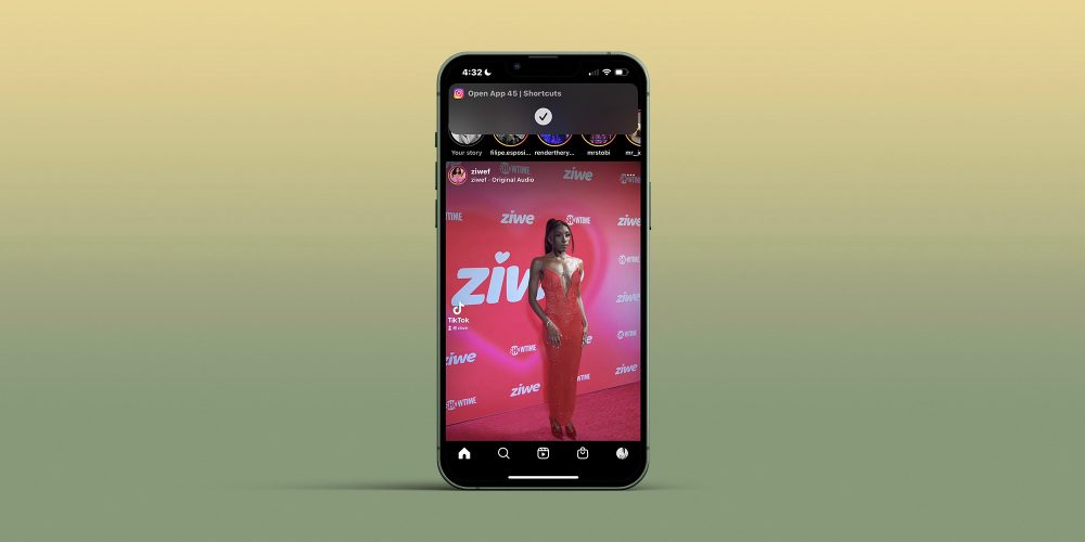
Additionally, every time I open any of my newly-created, earthy apps (re: shortcuts), I see this little swoopdy-woop that comes and goes – which can be dismissed with a swipe – but will appear every time I open a shortcut, forever, in perpetuity:

Last but not least, now that I’ve re-designed all of my apps to look exactly how I want them to with the help of my icon pack on my home screen, I am left with a clutter of icons, widgets, and wallpapers in my photo album(s) in addition to zip files and folders on my desktop that now need to be cleaned up.
iOS 16 to the rescue?
After chatting with some of my colleagues over at 9to5Google, I learned some things that Apple’s forthcoming iOS 16 could do to improve this process.
To start, iOS 16 could simply include any available themes for our home screens, let alone customizable ones. Did you know that what took me four hours would take someone about a minute and a half on an Android? I’ve seen a video of it being done. Android users have loads of built-in themes to choose from, and that barely scratches the surface.
More specifically, did you know that when you pick a color theme on an Android for your home screen, apps that are native to the phone automatically update to that specific color palette? Imagine not having to individually create and customize each and every one of your apps into a shortcut, whether or not they’re from a third party. If iOS 16 at the very least allowed us to customize native apps and widgets with pre-chosen themes, that would be a huge step in the right direction.
Final thoughts
I want to say here for the record, that on a scale of tech-savviness – 10 being extremely tech-savvy, and 1 being not at all – I’m like…a 7, probably, at least in comparison to your average person (not in comparison to literally any of my coworkers). That said, this process was nothing short of hellacious, even with help from my coworkers, even as someone who knows and understands very niche information about very specific technology. In total, I spent about four hours creating my home screen aesthetic, from start to finish.
What did we do to Apple, except be wildly – and for me, inexplicably – loyal customers to whom they withhold the ability to customize our own devices? Now that I’ve seen what my home screen can look like – while also understanding on a level that I wish I didn’t – what it takes to get a home screen that you love, I want everyone to have icons, widgets, and themes that reflect their personality. Why does Apple refuse to give us any autonomy as consumers?
As I was lamenting to my coworkers at 9to5Google about my customization ordeal, Ben Schoon said, rather joyously, “Come to Android – it’s so much easier ?..” I won’t, again for reasons I can’t explain, but that’s not the point.
The point is this: for Apple to gatekeep customization from its user base is, at this stage, an antiquated, frustrating, and frankly outlandish approach for a company that touts creativity, inspiration, and innovation in each of its individual products. If I want to be inspired by my device, to be creative with my device, to innovate on my device, why can’t I make it my own?
Author: Laura Rosenberg
Source: 9TO5Google


