For years, Apple has been the lone holdout in a sea of all-screen phones with punch-hole cutouts that house selfie cameras. The black rectangle that sat at the top of its flagships since the iPhone X has drawn some criticism, but mostly ambivalence. Apple has kept it around, in large part because Face ID requires sophisticated cameras that can’t easily be downsized. Meanwhile, Android phones have either used punch-hole cutouts or moved on to under-display cameras, aided by the adoption of in-screen fingerprint scanners.
With the iPhone 14 Pro, Apple is leaving the notch behind and using a pill-shaped cutout instead to house its front cameras. But it’s not just changing up the hardware and calling it a day. The company also uses software and animations to make the cutout feel more useful and better integrated into the interface than on Android phones. In true Apple fashion, the company is also giving the feature a fancy name: Dynamic Island. Leave it to Apple to be late to the party, do things a little differently and slap some grandiose branding on it.
Pros
- Useful Always On Display
- Good battery life in spite of AOD
- Dynamic Island feels slick
- Easy eSIM setup
Cons
- No USB-C
Pros
- Always On Display is more useful than Android versions
- Bright and roomy screen
- Dynamic Island feels slick
Cons
- Hefty
- No USB-C
The Dynamic Island isn’t the only example of Apple adopting a feature late but doing it its way. The iPhone 14 Pros also bring a 48-megapixel camera system and Always On Displays that show your entire lock screen, instead of a simplified interface. Add Emergency SOS via Satellites and the removal of the physical SIM tray and the iPhone 14 Pros feel like notable upgrades.
Design
But, giant pill-shaped hole aside, they don’t look that much different from their predecessors. Even that difference is actually fairly minor. When it isn’t doing anything, the Dynamic Island is still a blank space at the top of the screen.
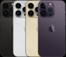
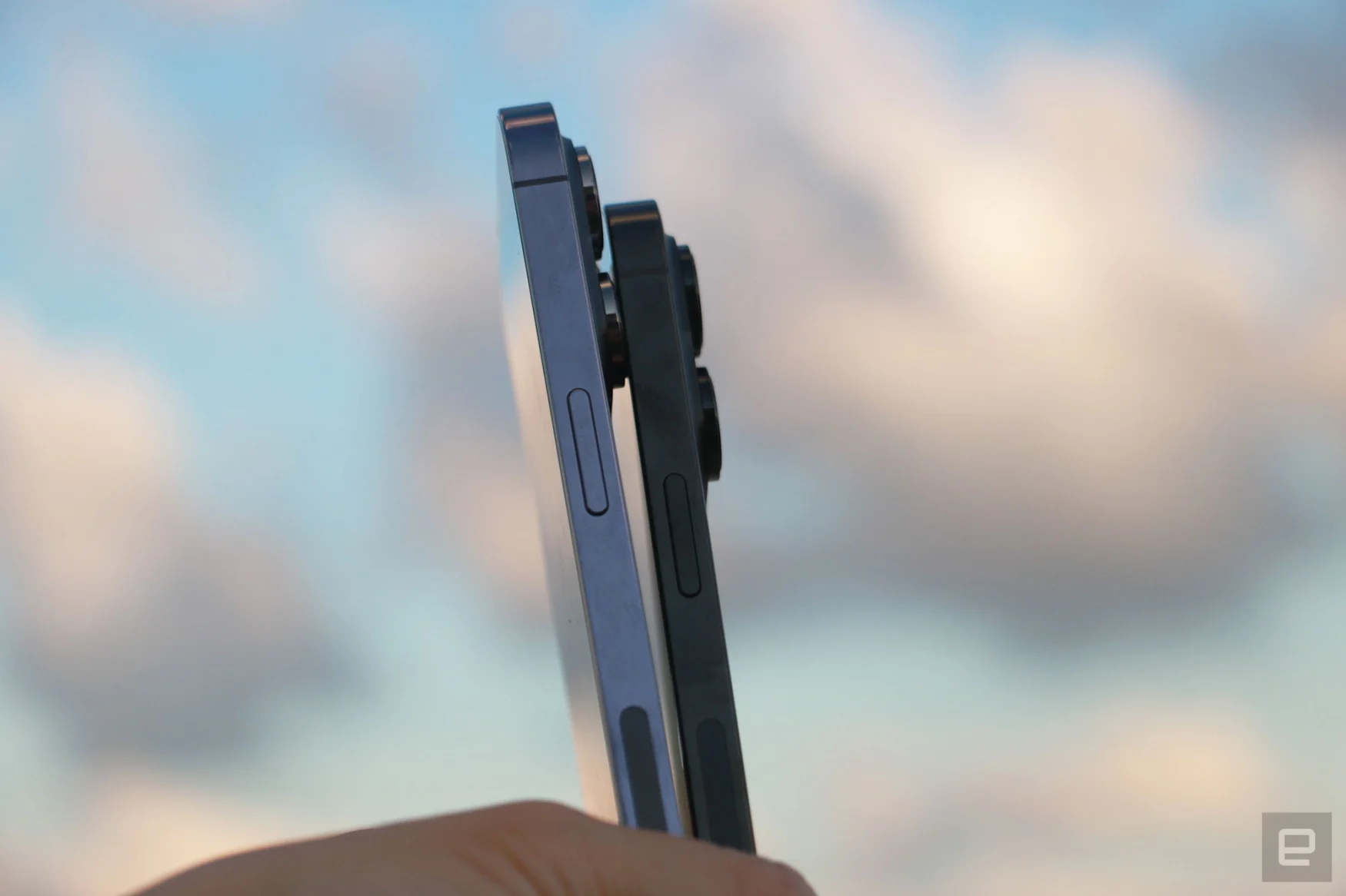
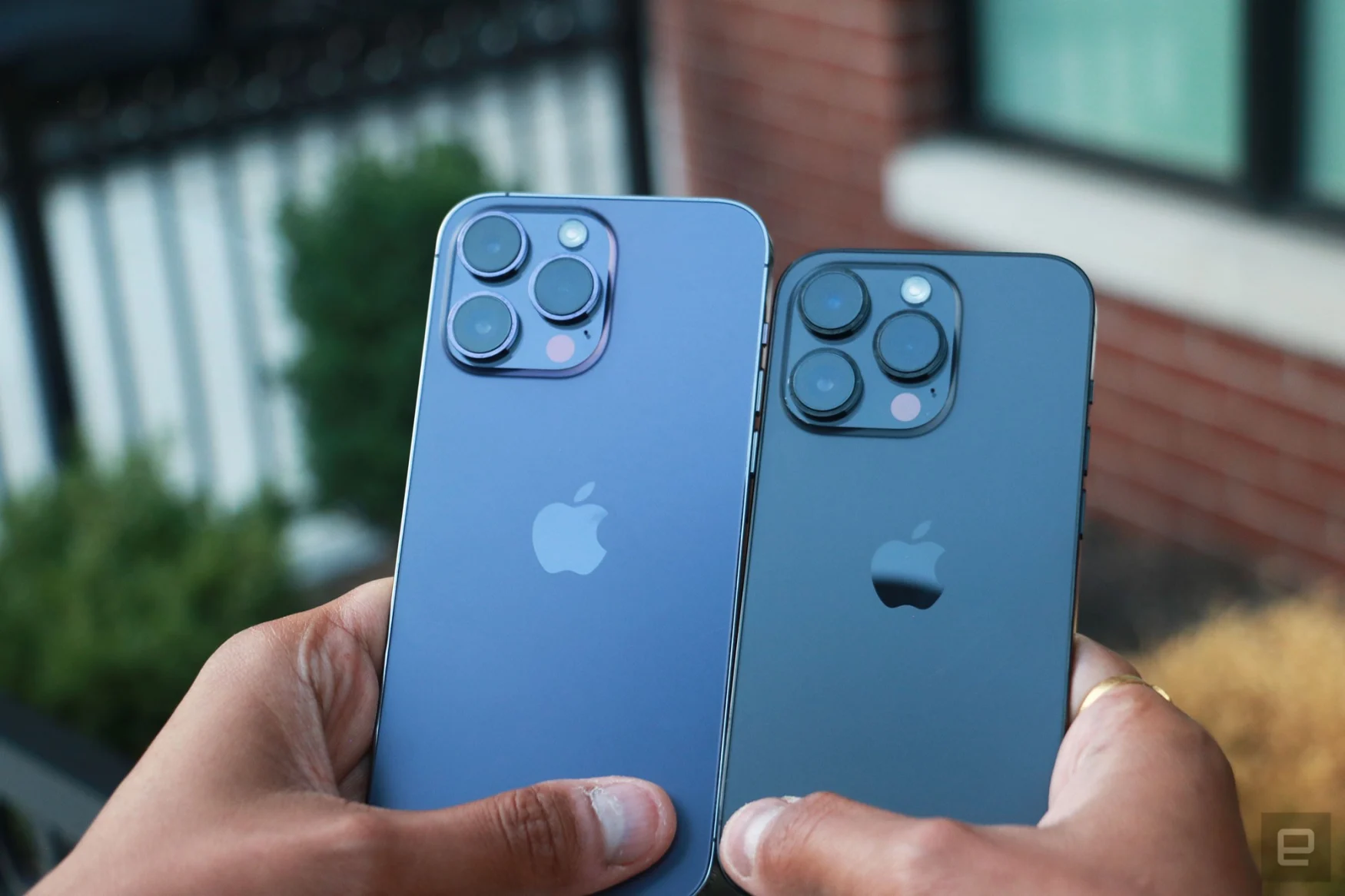
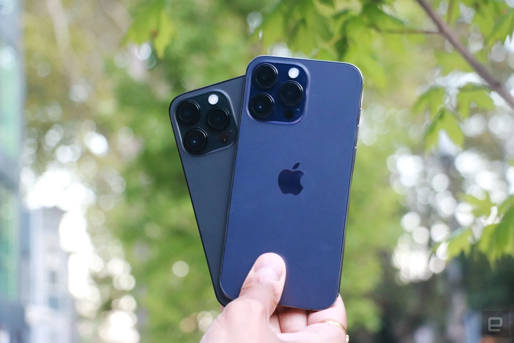
The new models are a teeny 0.01 inches thicker and a hair shorter than last year’s. The smaller Pro also gained a bit of weight – 0.07 ounces (or 2 grams) to be exact. The Max still feels like a massive brick of a phone that could crack your skull open if it fell while you were reading in bed, but if you’ve used previous models, you know what you’re in for. From the back, the iPhone 13 Pro and 14 Pro look basically identical, and you can only sort of tell them apart by the fact that the latest model’s cameras are ever so slightly bigger.

Living on Dynamic Island
Let’s not pretend that the notch has gone away. It may no longer extend from the top bezel, but the camera cutout here is larger than those on Android phones. When nothing is happening in the space, the hole is still obvious, especially when watching a fullscreen video. In fact, when I was switching between the iPhone 14 and the Pro, I didn’t notice a big difference. Still, by ensuring the camera is always camouflaged by software, Apple isn’t just providing a faux full-screen experience, it’s also giving it an air of usefulness.
When you start a timer or play a song and swipe up to go to the home screen, for example, an animation shows the app jumping into the island. That space stretches a little to make room for a clock or album cover on the left, while a countdown or a dancing waveform sits on the right. Tap the island and it’ll take you back to the app. Long press it, and the box expands further to show more controls.
It’s not much easier or faster than swiping down from the top to access the playback box, but I guess this way there’s an obvious indicator something is happening. The animations throughout this experience are slick, making everything feel polished and thought-through.
The island’s extra width when something is in it causes things like the cellular connectivity symbol to go away, and you’re left with the WiFi and battery icons. In the case of a timer, the island is so long that only the battery indicator is left. For the most part, I didn’t find this problematic, though I’ve yet to be in a situation where I needed to have both a countdown running while keeping an eye on the number of bars I was getting.
Dynamic Island works with apps that use the Now Playing API, CallKit and the Live Activities API introduced at WWDC, so most developers shouldn’t have to edit their code to accommodate. For now, only incoming calls in third-party apps that use CallKit have more controls in the Dynamic Island. Outgoing calls will just show an icon, though this will be fixed in a software update later this year. The Live Activities API isn’t available yet either, but developers can use it later this year as well.
Most apps already avoid the notch area on iOS, but every now and then something trickles through. On Telegram, for example, part of a blue badge peeps out above the pill. When multiple activities are taking place at once, the island splits into two, forming a horizontal exclamation mark. I started a Maps navigation while playing Spotify and running a countdown, and the directions took over the main island while the album cover jumped over to the right, for instance.
I need to spend more than a week with the iPhone 14 Pro to know how much of an impact it would make on my life, but for now, the biggest effect is aesthetic. Seeing the pill change into a square when signing into an app or Apple Pay with Face ID, as well as the turn right arrow appear when I’m navigating somewhere, is a nice touch.
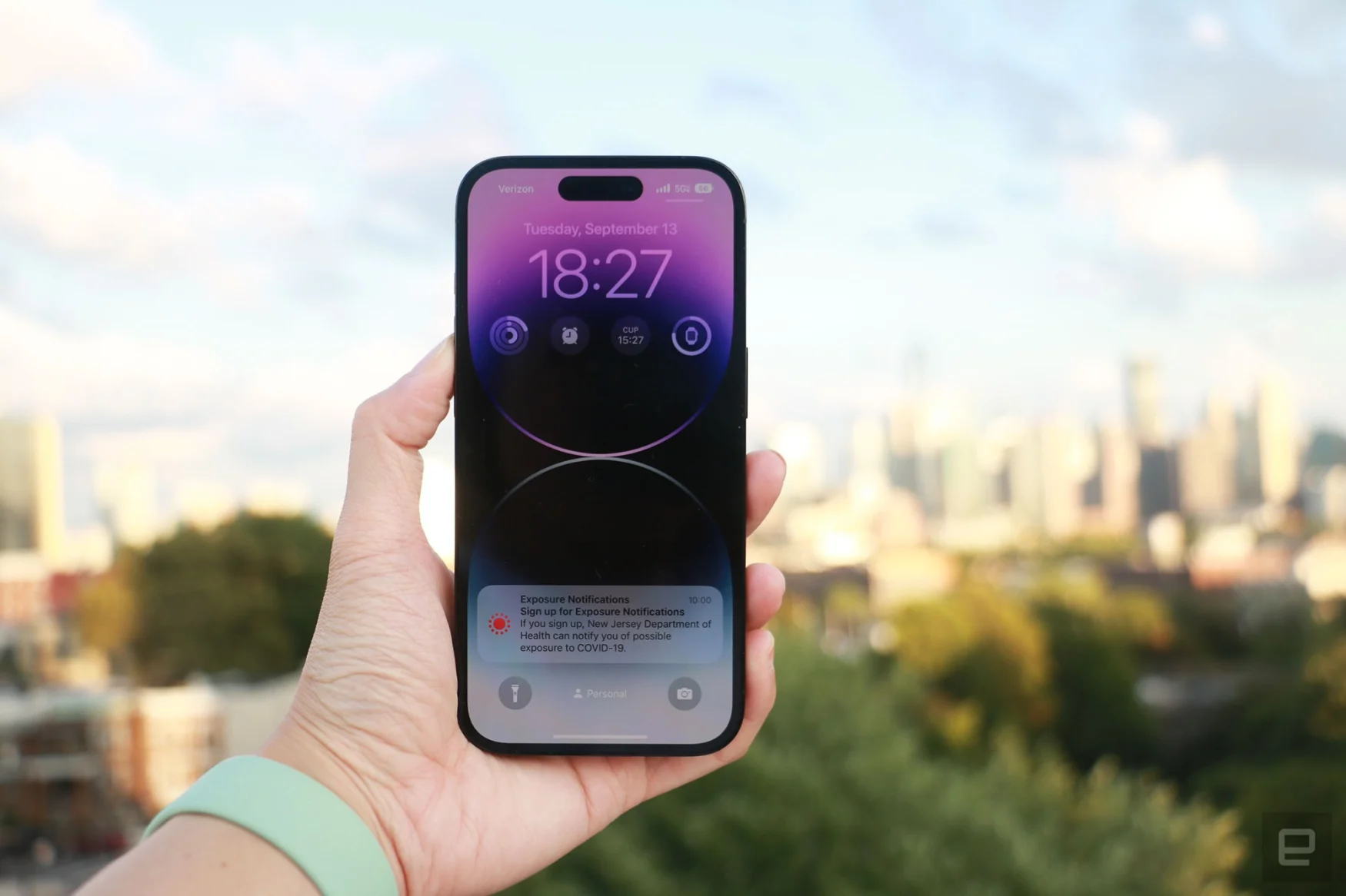
In general, notifications feel neater, too, in part because they happen in a persistent space instead of a translucent box that slides in and out from the top. The fact that it’s a black box with text in colorful font also makes it easier to see.
Display and audio
Dynamic Island aside, Apple hasn’t changed much about the iPhone 14 Pro’s screen resolution. You’ll still find a 6.1-inch and 6.7-inch Super Retina XDR panel on the Pro and Pro Max respectively, and they support ProMotion for refresh rates of up to 120Hz. Though they both pack slightly more pixels than their predecessors, the Pro still offers the same density at 460 ppi, while the Pro Max is a slight 2 ppi higher than before. But Apple did make the displays brighter. They can hit up to 2,000 nits outdoors, and 1,600 nits indoors when playing HDR video. I did have a slightly easier time reading things off the iPhone 14 Pro than on the 13 Pro, though the difference isn’t significant.
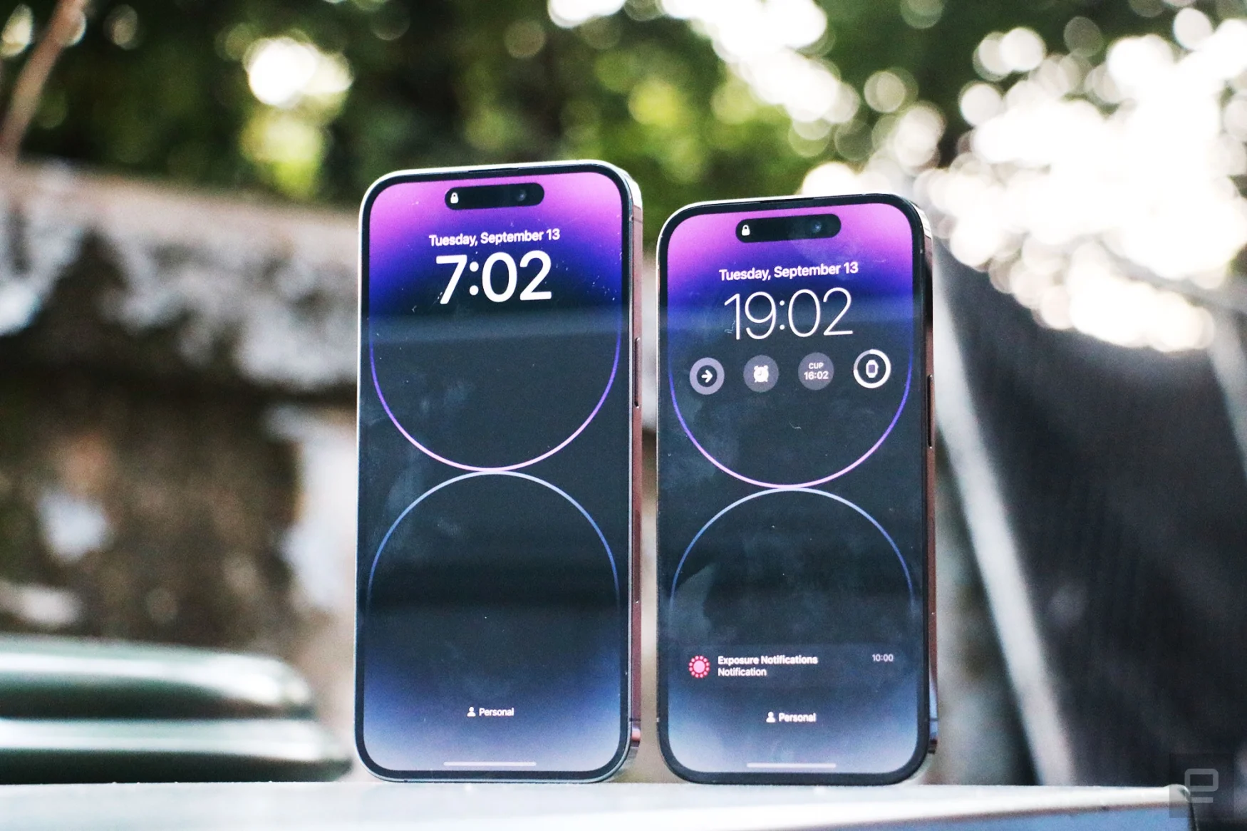
On the surface, the Always On Display (AOD) might not seem like a huge change, but a lot has been done under the hood to make it work well without overtaxing the battery. The AOD runs at just 1Hz, and Apple improved the LTPO (or low-temperature polycrystalline oxide) display to ensure graphics and colors still look good. It also made a new low power supply for the AOD and with a dedicated coprocessor that updates the screen without having to tap the CPU. For things that change predictably, like the clock or a countdown, the system prerenders frames and feeds them to the AOD when needed.
Finally, using the proximity sensor, which is now behind the display, the AOD is turned off when it detects occlusion — like when you flip your phone face down or stick it in your purse or pocket. It’ll also be disabled during a Sleep focus, low power mode or when you’re using CarPlay, since Apple believes you won’t need to see your AOD during those times. In some other scenarios, like when you use the Continuity Camera on macOS or if you’re wearing an Apple Watch and leave your phone, the AOD turns off too.
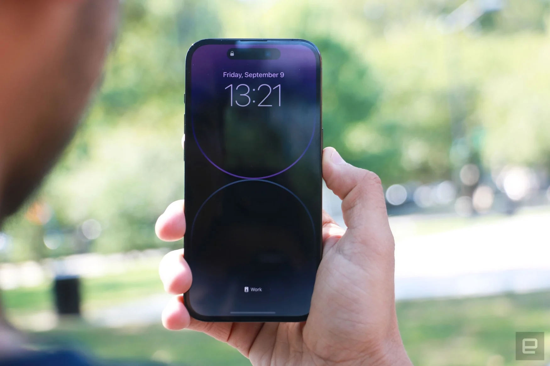
While Samsung and Pixel phones give you a black-and-white screen showing just the clock, date and weather along with a row of indicator icons, Apple actually presents your full lock screen, complete with wallpaper and widget support. As someone who doesn’t use a personalized background, I don’t find that a major plus. But it is helpful that Apple shows you actual notifications instead of just the icon for an app. By the way, if you’re concerned about privacy, or just don’t like this, you can turn off the AOD in Display settings.
Because it’s so similar to the lock screen, I sometimes got confused and would hit the power button in an effort to turn the display off. I also would try to swipe left to use the camera, thinking the page was active, when in fact the phone was in a “sleep” state with the AOD on. Eventually, though, I got used to this and remembered to double tap before swiping to access the camera.
I also used the iPhone 14 Pro to play music in my new apartment as my usual speakers hadn’t been set up yet. As expected, it’s not as loud or clear as a proper speaker, but provided ample volume and decent background noise. The playlist of sing-along songs like Stronger by Kelly Clarkson or Oops I did it again by Britney Spears lacked bass and sounded a bit noisy in the mid levels, but was generally typical of a smartphone.
Emergency SOS and eSIM setup
All iPhone 14s, Pro or not, will be able to connect to satellites so you can send emergency messages when cellular or WiFi signals aren’t available. Thanks to a new high-g accelerometer and a high dynamic range gyroscope, they’re also able to detect if you’ve been in a severe vehicle crash detection. This isn’t something I can safely test, so we’ll have to take the company’s word that the feature works. Meanwhile, Emergency SOS via satellite is rolling out in November in the US, so I haven’t been able to check it out either. But based on a demo I took following the Apple event, it appeared to work.
First, when you’re away from cellular and WiFi networks, you’ll see an SOS graphic that lets you know you can still dial 911 and the iPhone will use any other available network to place your call. But when none of those are available and you want to use Emergency SOS via Satellite, you’ll first have to use the Phone app to dial 911. When the device is unable to connect and you’re in a situation with satellite access (i.e. you’re not surrounded by buildings and are in the wilderness with a clear view of the sky), Apple will prompt you to use satellite communications.
Having to first dial 911 seems unintuitive if your focus is trying to send a text or connect to a satellite, but Apple wants you to think of this feature more as a backup to calling emergency services. Only when you fail to connect to 911 should you consider satellite messaging as a fallback. The company has relay centers set up, too, with staff who are trained to help users get in touch with the closest emergency responders in case there aren’t any nearby that accept text messages.
During my demo, an Apple rep showed what it would look like when communicating with one such relay center (presumably aware that we were in a hypothetical situation). After failing to reach 911, the iPhone 14 showed a few multiple-choice questions that the rep answered quickly, describing their condition and environment. The system then sent a report summing up the situation and providing the latitude and longitude of our location. While that message was being sent, our demo iPhone 14 appeared to lose connection to the satellite it had first latched on to and we had to wait till another came by to finish sending the report. When that was done, the phone brought up the conversation that it had started in Messages with emergency services.
Texts that were sent over satellite were in gray bubbles, while the responses came back in green. We went back and forth with the responder until a theoretical team had been dispatched to our location.
The satellite communications tool can also be used in the Find My app to share your location with family and friends. I was able to test this out at the demo, and I followed the directions on an iPhone 14 to point at a satellite coming over the horizon behind Apple Park. I was told to stay still while a connection was established, after which my location was sent to a contact on the sample iPhone. The system will tell your friends that your position was shared “via Satellite” — in case those bragging rights are important to you. Then, you won’t be able to send your location via satellite again for 15 minutes.
While I can see people potentially abusing this for sheer entertainment, I can also see how it might be useful to keep your loved ones abreast of your whereabouts as you wander out in the wilderness. This shouldn’t be a feature that impacts your daily life, but that could be very helpful if you’ve lost your signal while exploring.
Another change to the iPhone 14 is the removal of the SIM card tray. I’ve long felt that a SIM-less world is a seamless world, and when carriers worldwide support it we will be able to more conveniently roam globally. The problem is, I’m not sure we have the infrastructure yet.
Apple may be a bit premature in getting rid of the SIM card tray, but it could give US carriers the push they need to adopt the format. Apple has offered eSIM support since the iPhone Xr in 2018, and the company says it’s had a lot of adoption growth. With the iPhone 13 last year, Apple started using eSIM as the primary method of activation in all US retail stores, too. In general, setting up my review unit’s service was painless — all I had to do was wait two minutes for Verizon to activate my line. Apple also offered the option of converting my existing physical card to a digital one without having to leave my apartment.
It’s funny that Apple has thrown caution to the wind and fully embraced eSIM before it adopted USB-C, though. The charging standard is more prevalent and would make many people’s lives more convenient. This is one area where the iPhone 14 Pro feels stuck in the past.
Cameras
With a new 48-megapixel primary sensor, updated low-light processing algorithm called Photonic Engine and new features like Action mode for improved video stabilization, the iPhone 14 Pros’ cameras promise a meaty upgrade. But in my testing so far, the changes seem minor.
In fact, most of the photos I took from the iPhone 14 Pro and 13 Pro are basically indistinguishable. Sometimes images from the newer phone were brighter, sometimes they weren’t. The 13 Pro delivers pictures that are slightly cooler with more saturated colors, and I frequently preferred its results. Meanwhile, the Pixel 6 Pro produced pictures that were about the same in terms of quality and split the difference in color temperature.
All three phones were adept at keeping details crisp even in shadows. The lines inside the roof of a shelter were sharp when I magnified the pictures. When I used the telephoto lens to zoom in to 3x, though, the iPhone 14 Pro produced the brightest image. It also delivered the punchiest colors on some graffiti under an overpass.
Gallery: iPhone 14 Pro camera samples | 28 Photos
Gallery: iPhone 14 Pro camera samples | 28 Photos
However, sometimes the iPhone 14 Pro actually does worse than the 13 Pro and Pixel. In my shots of a park, the 14 Pro had the least saturated greens. In general, the quad-binning of the 48-MP sensor doesn’t seem to drastically improve image quality, at least in daylight.
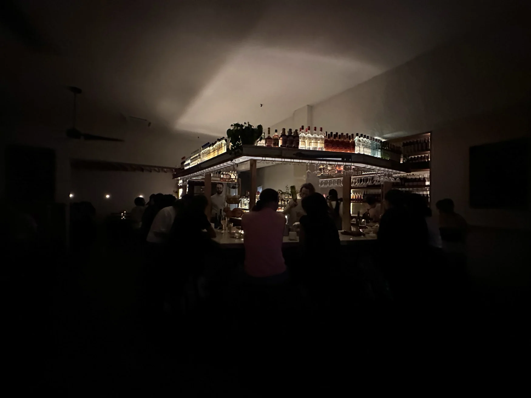
A similar story can be told of the cameras in low light. In one example, the iPhone 14 Pro’s shots had the most accurate color and cleanest details, beating the Pixel 6 Pro at capturing the individual lines on a leaf. But Google’s flagship did a better job with a picture of a bright bar in a dim restaurant. It clearly captured individual leaves on a potted plant on a shelf, while the same part of the picture was shrouded in shadow when shot with the iPhone 14 Pro.
The Pixel also took generally brighter nightscapes of Manhattan, with the iPhone 14 Pro coming in very close behind and differences boiling down to minor variations in color temperature. Both devices rendered the words “Now Leasing” on a faraway building equally clearly — that is to say, slightly mottled but impressive for how dark and distant the lettering was. Compared to the 13 Pro, too, the latest iPhone doesn’t offer a huge improvement. But Apple is definitely closing the gap on Google when it comes to low light performance.
I still prefer the Pixel for portrait shots, though. While the iPhone 14 Pro’s new focal length of 24mm is supposed to be better for portraits, it still isn’t as adept as Google at picking out subjects and blurring out the background. I used all three phones to snap a friend chilling with one leg up on a park bench, and the Pixel was best at keeping the scar on his knee in crisp detail.
In general, most people comparing the iPhone 13 Pro and 14 Pro won’t notice a major difference in picture quality. But advanced users will appreciate the ability to shoot 48-MP images in ProRaw, which will allow them to capture greater detail.
Video is another area that got an improvement too, with support now for up to 4K resolution and 30 frames per second in Cinematic Mode. I don’t usually shoot clips that sharp, but the footage I got of a dog chasing a frisbee came out smooth and vivid.
I also checked out Action Mode by chasing my friend up and down a path, recording both with and without the new stabilization feature. I did notice slight improvements, but frankly, Apple was already delivering impressively stable footage.
The same can be said for selfies taken with the TrueDepth camera up front. In general, the iPhone 14 Pro’s pictures here came out slightly brighter than the 13 Pro’s and, although autofocus is a new feature, I haven’t noticed a big improvement. In selfies where I was headbanging or where a friend was fidgeting, both the iPhone 13 and 14 Pro delivered crisp shots.
So the changes to the iPhone 14 Pro’s cameras aren’t a dramatic jump from last year’s model, but anyone looking to upgrade from an iPhone 12 Pro or older is likely to find the latest flagship a satisfying improvement.
Performance and battery life
As expected, the iPhone 14 Pro and Pro Max are smooth, well-tuned machines that can handle any task thrown at them. Apple’s new A16 Bionic chip handled my massive selfie binges while playing Spotify in the background alongside concurrent timers, Maps navigation and more. In the brief time I’ve had the iPhone 14 Pro, it’s gotten warm but not uncomfortably so, which is more than I can say for my Pixel 6 Pro and iPhone 12.
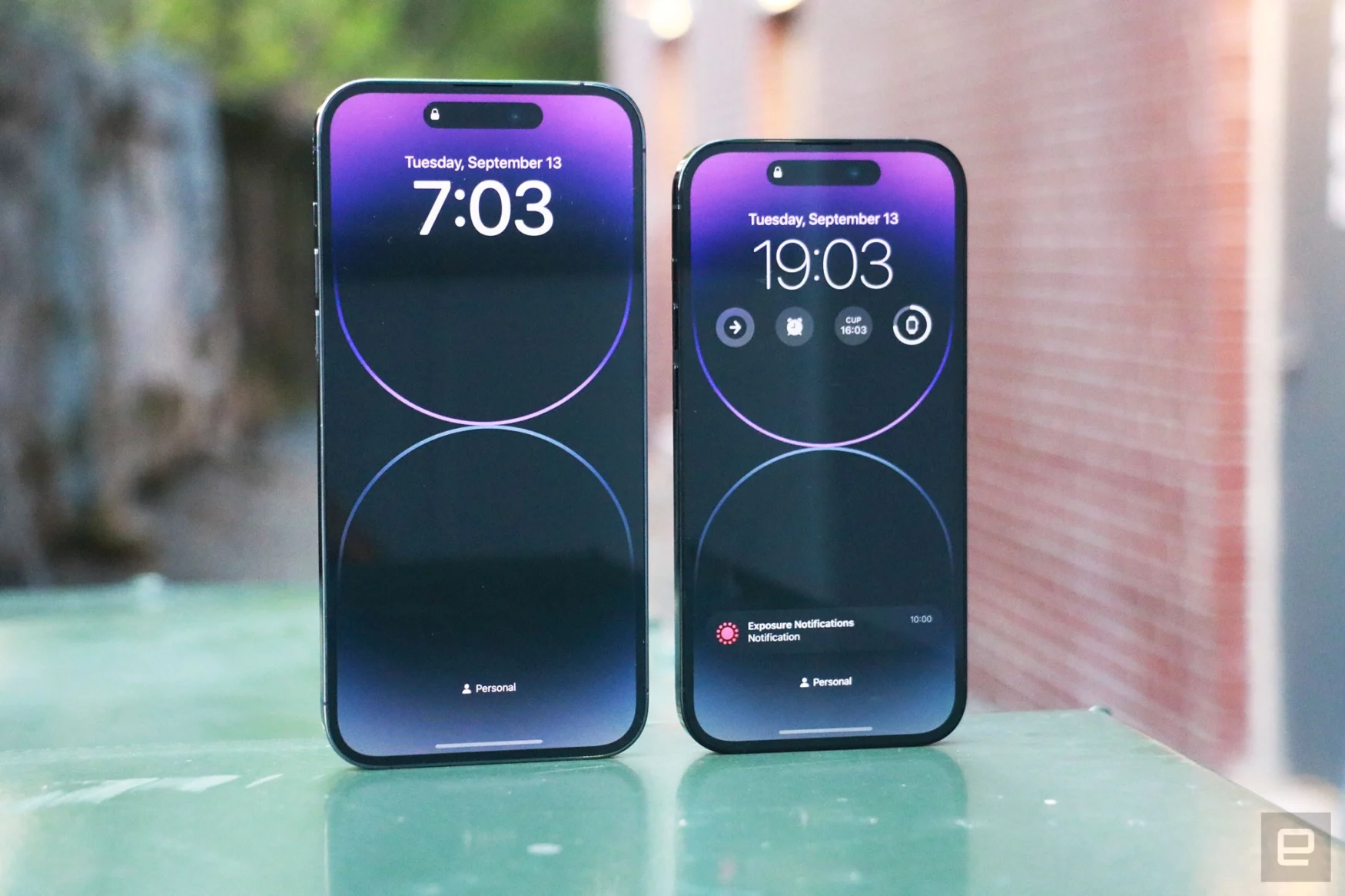
In spite of the AOD I haven’t noticed the battery running perilously low even after a long day starting with a 10am workout, followed by numerous camera test sessions and a night out. I got home at 1am with some juice to spare. One night I forgot to charge the iPhone 14 Pro and had to run to a morning workout with just 19 percent in the tank. It still lasted more than an hour and I was even able to do some testing.
Wrap-up
From the outside, the iPhone 14 Pro and Pro Max don’t look dramatically different from their predecessors, aside from the Dynamic Island. But thanks to the Always On Display and crisis-preparedness features like crash detection and Emergency SOS, the iPhone 14 Pros feel potentially more useful in unforeseen circumstances. Sure, the camera updates feel less significant than I expected. But anyone upgrading from an older phone will appreciate what Apple has to offer.
Author: 92
Source: Engadget


