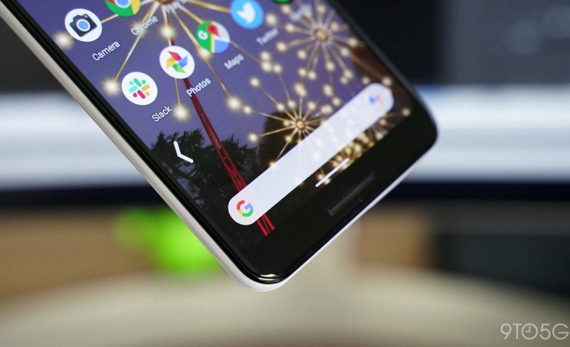
Google has been taking a lot of feedback on gesture navigation from the brave folks who have been testing it in the Android Q Beta releases. With Android Q Beta 6, Google is making gestures just a little bit more seamless by hiding the navigation bar on the home screen.
One of Google’s goals for gesture navigation in Android is for the experience to feel seamless and somewhat self-explanatory. While there’s certainly a long way to go, one minor issue that Google is tackling is that there’s not really a good reason for the navigation bar to appear on the home screen.
Normally, the Android Q gesture navigation bar visually explains that you can swipe upward to get to the home screen and to the left or right to switch between apps. From the home screen, that same upward swipe gesture instead opens the app drawer, which isn’t part of the navigation bar’s job.
To remedy this, Google now hides Android Q’s gesture navigation bar whenever you’re on the home screen. It’s an admittedly minor change, and yet it goes a long, long way to making the home screen feel immersive. Now if only the status bar were transparent, then we’d really have a fantastic home screen experience.
Check out 9to5Google on YouTube for more news:
Author:
Source: 9TO5Google
Tags:


