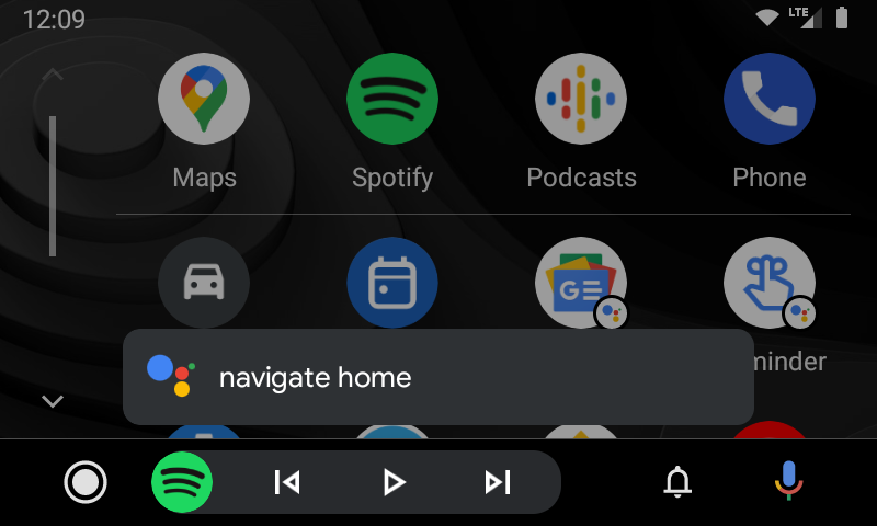
Google has been giving its Android Auto platform quite a bit of attention as of late, including some adjustments to the look of Google Assistant. Now, yet another UI tweak is rolling out to some users with Android Auto showing the Assistant UI on the left part of the screen.
The previous Assistant UI, which you can see here, put the Google Assistant “listening” indicator at the bottom of the display on a hovering card. From there, the signature four colors would animate as you speak before going away after the command is processed.
With this revised interface, the same hovering card is kept, but Google now shows text as you speak (albeit slightly delayed) and pushes the Assistant animation off to the left side. Once a command is accepted, it “locks in” and shows the standard Assistant logo before the card goes away entirely. It’s a slick little animation and, in my opinion, a marked improvement over what was previously available.

This isn’t the first tweak Google has made to Android Auto’s UI over the past year or so. In August, Google made songs show up in the bottom bar alongside media controls. Looking back to last December too, Google tested out some Google Assistant redesigns before widely rolling one of them out.
We’re not entirely sure how widely this change is rolling out, though, but it appeared on Android Auto 5.7 when connected to a Pixel 5 as well as a Galaxy Z Fold 2 running the same version.
More on Android Auto:
- Android Auto now shows song titles in the control bar when switching tracks
- Android Auto readying custom shortcuts for Google Assistant actions and contacts
- Free YouTube Music users can now use Android Auto app to play uploaded songs
Author: Ben Schoon
Source: 9TO5Google


