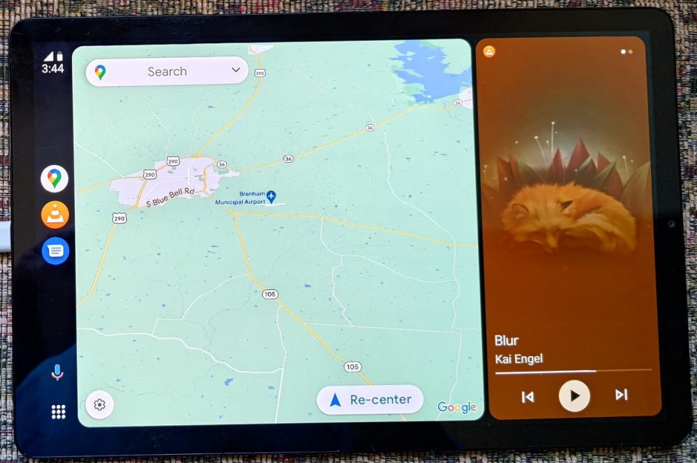
Google has begun rolling out Android Auto version 8.2 to those enrolled in the beta, bringing a revamped dock to the much-anticipated “Coolwalk” redesign.
About APK Insight: In this “APK Insight” post, we’ve decompiled the latest version of an application that Google uploaded to the Play Store. When we decompile these files (called APKs, in the case of Android apps), we’re able to see various lines of code within that hint at possible future features. Keep in mind that Google may or may not ever ship these features, and our interpretation of what they are may be imperfect. We’ll try to enable those that are closer to being finished, however, to show you how they’ll look in the case that they do ship. With that in mind, read on.
As showcased many times over the last year, Google has been working on a redesign of how Android Auto looks on car screens. Internally, this redesign is dubbed “Coolwalk,” and Google has even acknowledged that Android Auto fans should see the redesign arrive soon — originally citing “this summer.”
Part of that redesign is the ability to better adapt to the many different sizes and shapes that are now used by car infotainment displays. Depending on whether you’ve got a tall screen or a wide one, Android Auto’s ever-present dock may appear along the bottom or the side of the display, showing the time, recent apps, and the Google Assistant button.
With the release of the first builds of Android Auto 8.2, we find that Google has prepared a new “rail dock” for the Coolwalk redesign, which would replace the existing hotseat. From what we can piece together, the main difference in the design is that the rail dock would allow up to four app icons to appear, making it easier to switch between apps — when safe to do so, of course!
From what we can piece together, only three of those four slots in the dock are currently being used. Each icon should represent a particular type of app — communication, media, and navigation — and presumably the most recently used app of each type will appear in its respective spot. As usual, the Google Assistant button will also still appear in this design.
By comparison, in recent photos of Android Auto’s Coolwalk, you can see a lone Google Phone icon appears in the hotseat.
Update 1:56pm: Mishaal Rahman has enabled the new dock design for Android Auto, showcasing it over on Twitter (with help from a specially modified tablet arrangement). Just as our investigation uncovered, the new dock has three app icons for navigation, media, and communication, respectively. As you open a new app in each category — such as opening Google Podcasts after using Spotify — the new app takes over that spot in the dock.

Thanks to JEB Decompiler, from which some APK Insight teardowns benefit.
More on Android Auto:
- Android Auto’s ‘Coolwalk’ redesign gives music apps like Spotify a useful dual-page widget
- Hands on: This Android Auto unit works wirelessly and can be installed in seconds in any car
- Review: Carsifi adds a quick-switch button to a wireless Android Auto adapter
Add 9to5Google to your Google News feed.
google-news
Author: Kyle Bradshaw
Source: 9TO5Google


