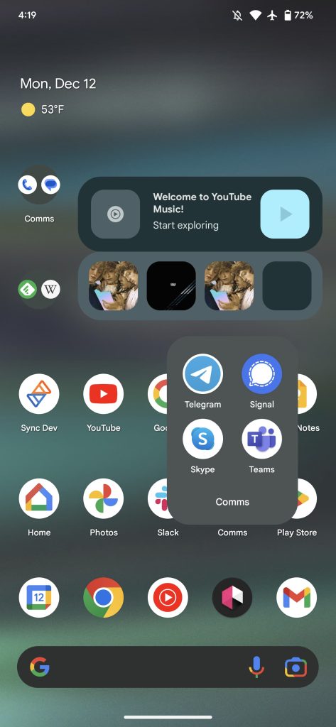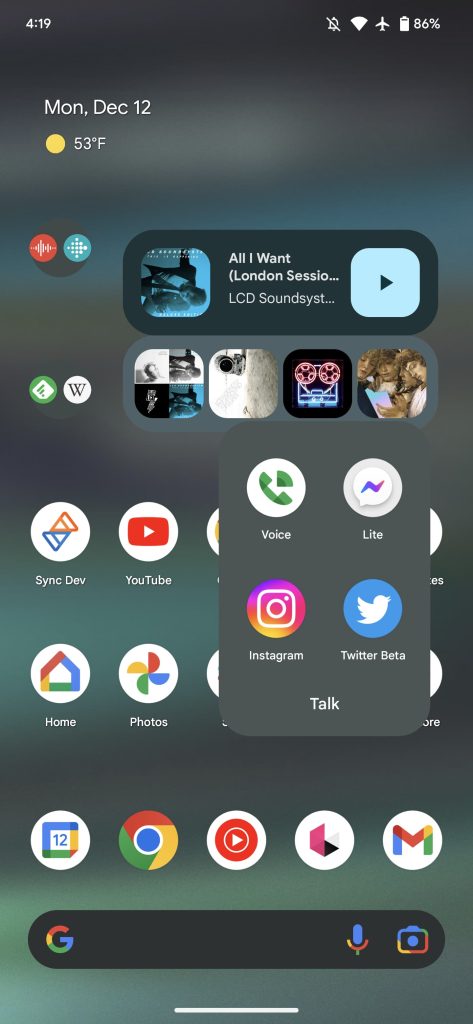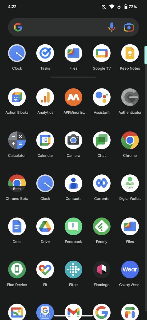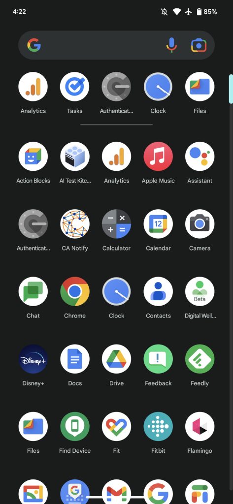
In the latest pre-release update to Android 13 on Pixel phones, Google has tweaked the padding and density of the Pixel Launcher.
While Android 13 has been available for a few months now, Google is still continuing to make gradual, quarterly changes for the benefit of Pixel owners. In fact, the company has released the first test version of an update (Android 13 QPR2) that will eventually become the basis of the March Feature Drop for Pixel phones.
With the preview update installed, we find that Google has made some subtle changes to the Pixel Launcher that may leave Pixel fans wondering why things look and feel different. The core of the change is that there’s now less empty space padding between app icons, making each row and column a bit more condensed.
To compensate for that difference, there’s now a thicker border of empty space around the edges of the screen, as well as above your row of shortcuts. Having a wider horizontal border may be a welcome change for owners of the Pixel 6 Pro or Pixel 7 Pro, moving more of the UI away from the curved edges of the display.


Meanwhile, a few other UI elements of Android 13 QPR 2 have been tweaked to match. For example, the Google Search bar is now a bit more narrow and the At A Glance widget is placed a bit more toward the center. In some cases, we’ve found this leaves even less room for app names, with even moderately long apps like “Google One” given truncated names like “Google O…”
Author: Kyle Bradshaw
Source: 9TO5Google


