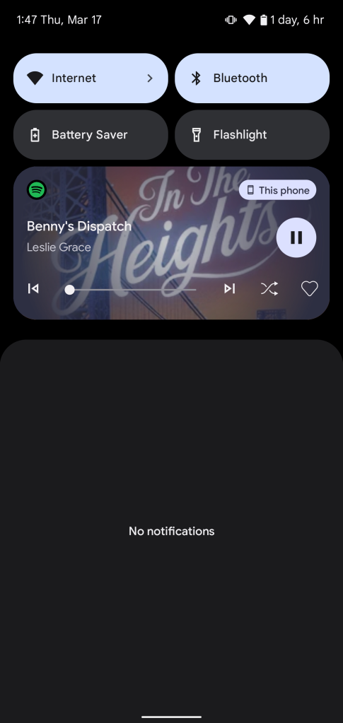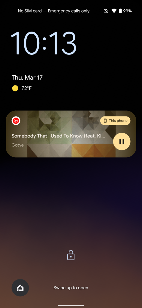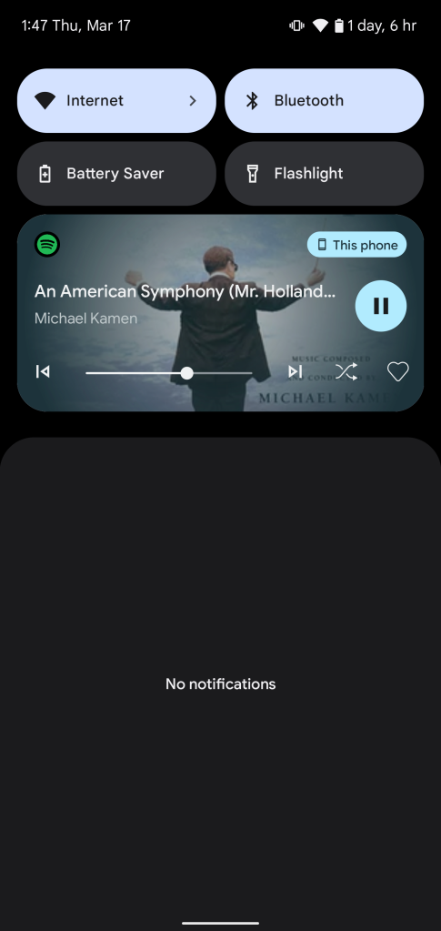
After sitting just behind the curtain in the first Android 13 developer preview, Google has released the new music notification panel with an updated design including (wonderful) album art integration and more.
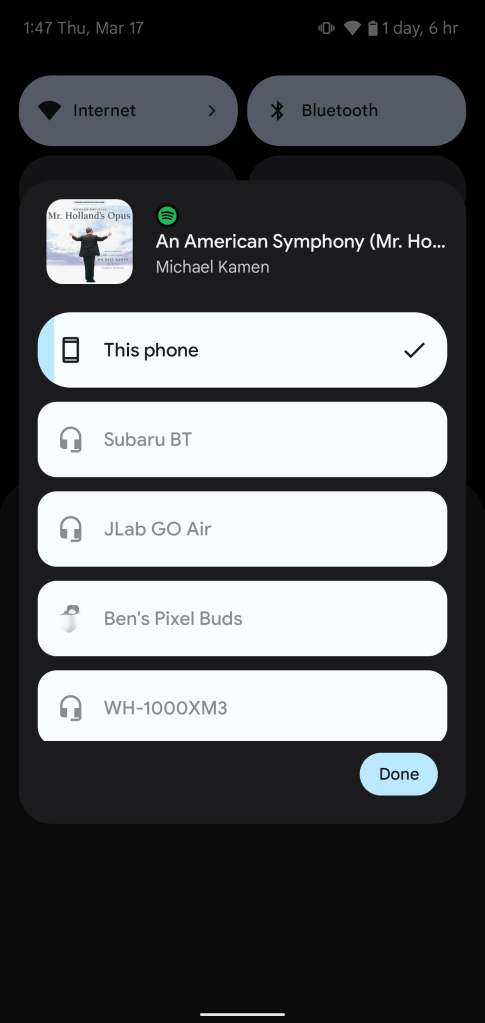
The new music panel in Android 13’s notification shade has the same basic functionality as previous versions, with song information and controls along with an output selection shortcut. As we noticed in the previous Android 13 preview, the output picker has picked up an updated UI which remains present in this new version.
The new UI also shuffles up the design as a whole with a dedicated play/pause button off to the right, skip and back controls along the bottom row with the track scrubber in between, and shuffle and like buttons present for Spotify.
In a bit of a flashback to previous versions of Android, Google has also integrated album art across the entire music panel in Android 13. The album art themes the background of the panel instead of sitting in its own box, and obviously changes based on the track you’re listening to. We’ve verified this works perfectly well with both Spotify and YouTube Music, and it looks pretty great if I do say so myself.


We’re still digging through the second developer preview of Android 13, so stay tuned for more! And let us know if you find something we haven’t in the comments below or on Twitter.
More on Android 13:
- Android 13 DP2: Google updates Quick Settings with settings and power buttons on the bottom
- Here’s everything new in Android 13 Developer Preview 2 [Gallery]
- How to install the Android 13 developer preview on Google Pixel
Author: Ben Schoon
Source: 9TO5Google


