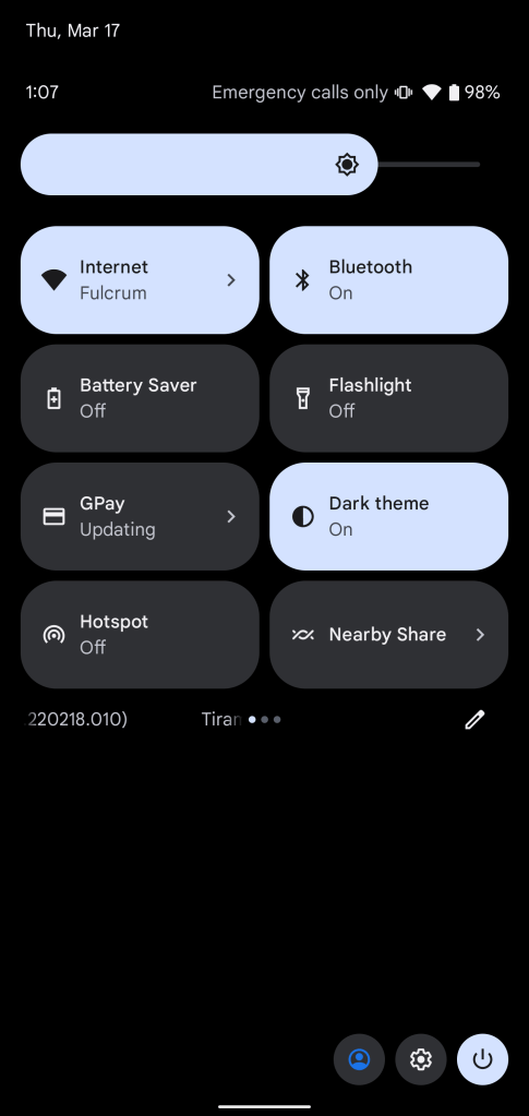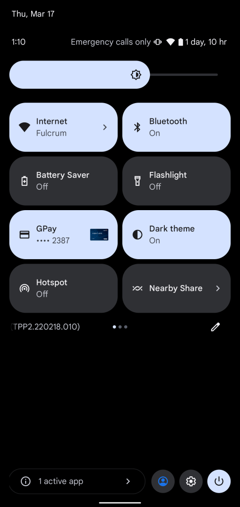
Google just released the second developer preview of Android 13, with a redesign to the Quick Settings panel that shifts other buttons to a new part of the display.
With this latest update to Android 13, Google is effectively turning the Quick Settings menu into a panel rather than its usual extension of the notification shade. The biggest change here is to the very bottom of the Quick Settings menu, which has removed a row of buttons for user profiles, settings, power, and edit to a more flexible design.
Now, the edit button appears directly beneath the quick settings in a row it shares with the page indicator and Android version number (at least in the developer preview). Then, at the very bottom of the display, Google has placed the power button in the far right corner, with shortcuts for settings and the user profile switcher off to the left of that button.
On the far left side of this row, Android 13 now shows “active apps” in a pop-out menu to show apps running in the foreground. Previously, this appeared as a tile.


We’re still digging through the second developer preview of Android 13, so stay tuned for more! And let us know if you find something we haven’t in the comments below or on Twitter.
More on Android 13:
- Here’s everything new in Android 13 Developer Preview 2 [Gallery]
- How to install the Android 13 developer preview on Google Pixel
- Google releases Android 13 Developer Preview 2 for Pixel phones
Author: Ben Schoon
Source: 9TO5Google


