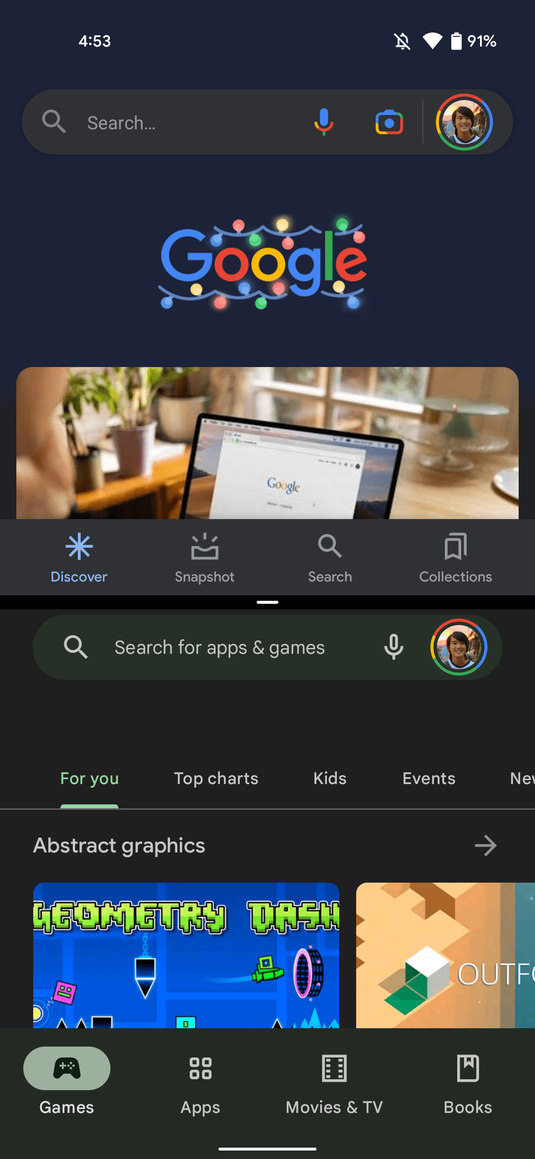
As we’ve been expecting since the start of this year, Android is getting a new “App Pairs” feature that is live in 12L Beta 1. On phones, it replaces the previous “Split screen” approach to multitasking.
From Recents/multitasking, tapping the icon at the top of the screen reveals the same menu as before. However, Split screen has been replaced by “Pin to top,” though the same icon is used.
Like before, that app shrinks down, but you now get the regular card size instead of a shrunken-down preview. Google has made the pull tab in between the two windows wider, while you no longer get a live adjustment. Rather, the app icons appear as the background flashes out until you stop adjusting.
The big change introduced by App Pairs in Android 12L is how groupings can be preserved in the Recents view rather than the top application being pinned in perpetuity. Multiple App Pairs can be created and accessed, while the joint card in multitasking features both icons at the top.
Meanwhile, you can double-tap the white divider to flip/switch the top and bottom apps/windows in the pairing (h/t Dylan).
App Pairs


Compared to other multitasking approaches — namely Microsoft’s on the Duo, you cannot save a pairing.
This capability is geared toward large screens, but there are some scenarios where it’s useful to have on mobile. Currently, the Android 12L Beta 1 emulator running on a tablet device shows a “Split” button, alongside “Screenshot” and “Select,” so App Pairs branding/implementation is not finalized.
Split screen


More on Android 12L
- Android 12L Beta 1 hands-on: Top new features [Video]
- 12L Beta 1: Google brings a new UI and animation to Internet toggle, screen recording
- Here’s everything new in Android 12L Beta 1 [Gallery]
- How to get the Android 12L Beta on Google Pixel
Author: Abner Li
Source: 9TO5Google


