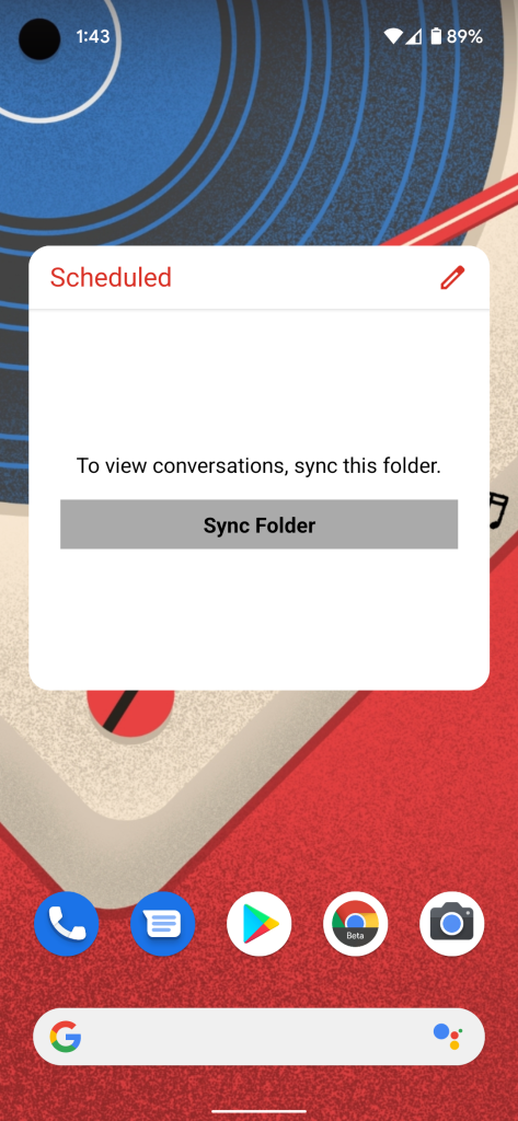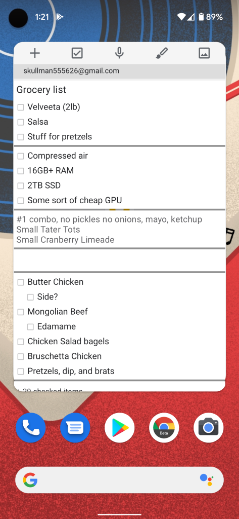
Following the recent popularity of homescreen widgets after their launch on iOS, Android 12 is giving some love to the OS’s long-existing widgets system, including a new menu, forced rounded corners, and more.
With Android 12 Developer Preview 3, Google has made quite a few changes to the widgets system. The most noticeable change, affecting your existing widgets, is that Android homescreen widgets now feature rounded corners — just like everything else in Android 12.
The effect is most pronounced on widgets that were previously square or rectangular such as those from Gmail and Google Keep. In the case of Gmail, Android 12’s adjustment to the widget is almost unnoticeable, giving it a card-like look that seems intentional. For Google Keep, however, which has no padding whatsoever, the forced rounded corners create a jagged edge in the widget’s design.
Meanwhile, the experience of adding widgets to your homescreen has also gotten a revamp in Android 12 Developer Preview 3, with a brand-new menu, complete with a search bar. Below the search bar, you’ll now find a pair of personalized widget recommendations. As you would probably guess, the new widget list also prominently features rounded corners in its UI.
-
Before -
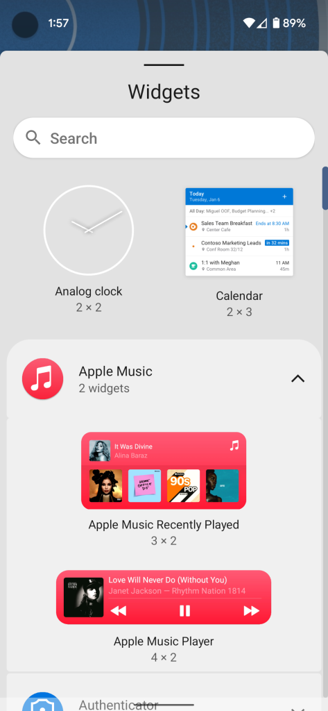
After
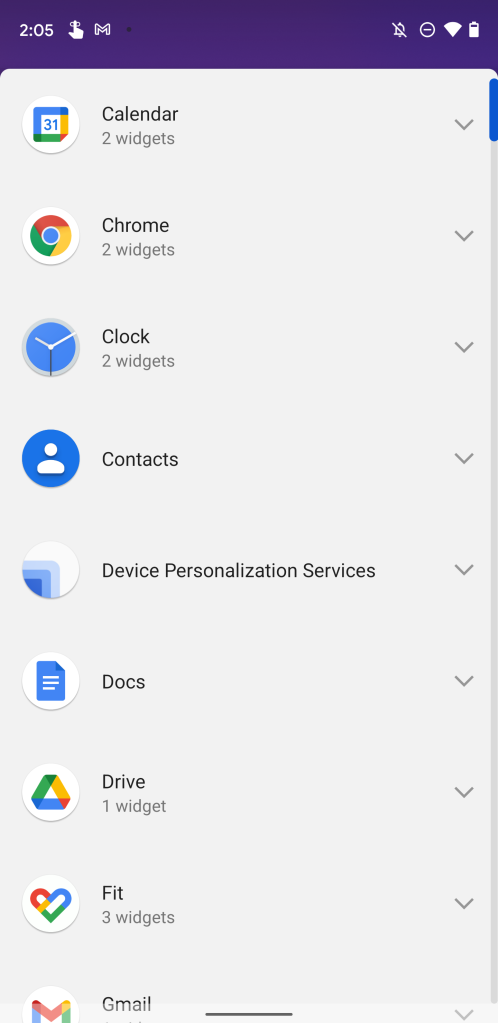
In a similar fashion, the more specialized list showing just a particular app’s widgets has gotten revamped too with Android 12 DP3. The view is now a bit more condensed, and cleaner overall.
-
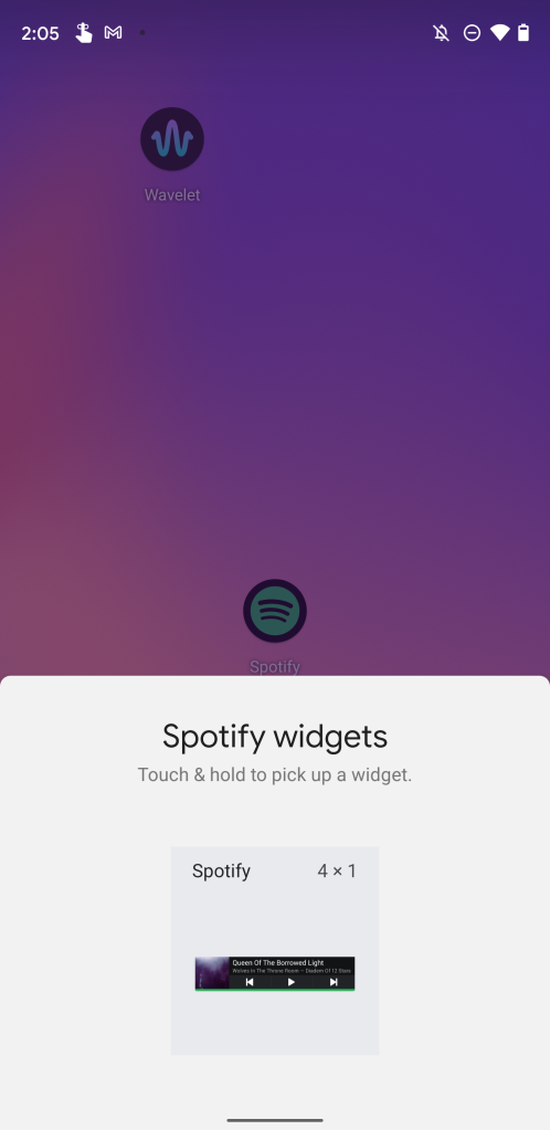
Before -
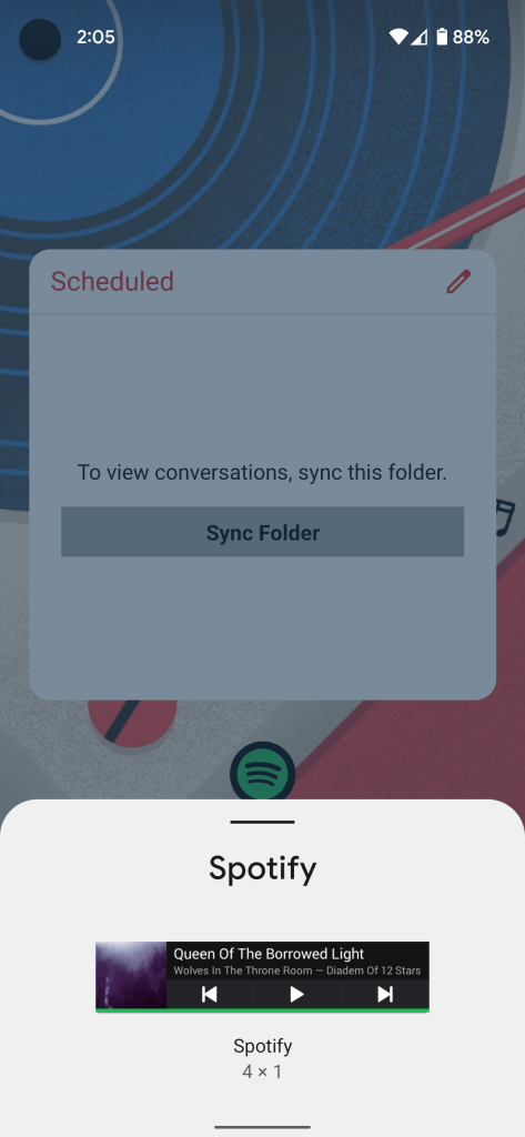
After
More on Android 12:
- Here’s everything new in Android 12 Developer Preview 3 [Gallery]
- Android 12 DP3: Screenshot editor and markup tool gains new fonts, launch animation
- Android 12 DP3: Pixel Launcher adds second 4×4 grid size with smaller app icons
Author: Kyle Bradshaw
Source: 9TO5Google


