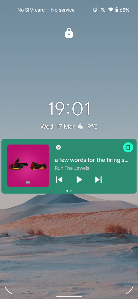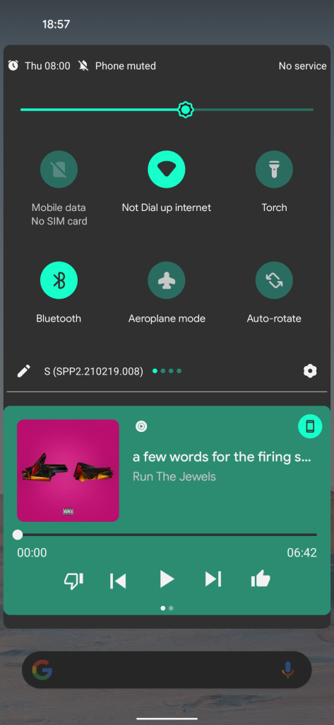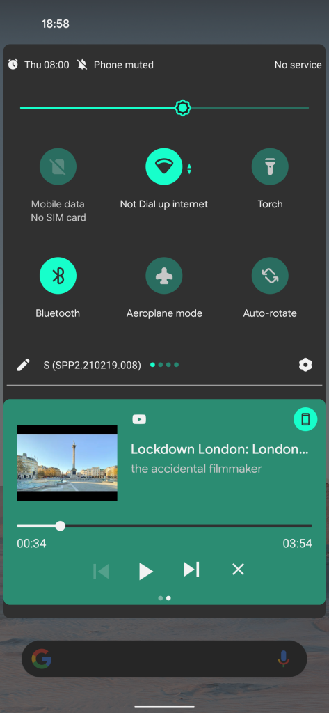
With the drop of the Android 12 Developer Preview 12, Google is changing the media player UI accent color to match your system theme rather than any content playing.
While not a massive change at first glance, it changes the prominence of certain portions of your device. Changes will be most prominently noticed on your lockscreen, where a change looks the starkest. Android 12 DP1 actually tweaked some of the layouts, but this is simply a change to the color of the media player UI, with all of the same functionality retained.
So to summarize, when choosing/selecting a system theming accent color within the “Styles & wallpapers” section, your chosen color will be used for any quick settings toggles, Settings pages, and now the accent color will apply to the media resumption UI and lockscreen media player.
Previously, almost every single media player section on your Pixel would be themed directly by the color of content currently playing. For instance, an album with maroon/red cover art would have an accented player to mimic the main color palette. You can see from the screenshots below that when a green color is now used, the album art or video content is more readily visible. It works just fine with every color within the Styles & wallpaper section too:
The original leaks of the Android 12 UI showcased early signs of this “core” accent-led color theming system, but while certain portions of the early Developer Previews have yet to be themed, the media player has proven to be a prime candidate.
- Android 12 DP2: New device search bar in the works for Pixel Launcher, possibly others
- How to downgrade from Android 12 Developer Preview 2 to Android 11 on Google Pixel [Video]
- Android 12 DP2: Picture-in-picture rework brings new gestures, stashing
- Android 12 DP2: Widgets list redesign and tweaks to lockscreen PIN, pattern entry
Author: Damien Wilde
Source: 9TO5Google


