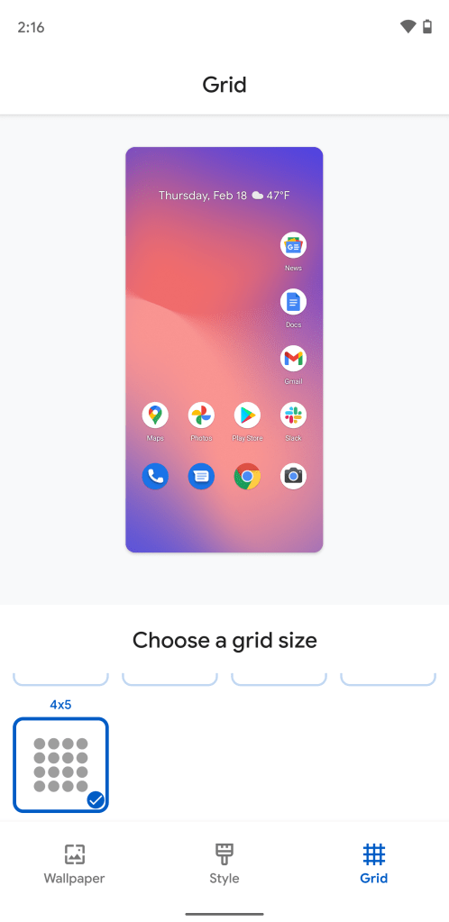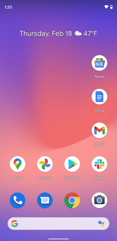
Today’s the big day of the Android 12 Developer Preview, and we’re hunting for changes large and small. One interesting small change we’ve spotted is that the Pixel Launcher now offers a new 4×5 grid option.
Last year, with the launch of the Pixel 5, Google introduced a new feature to the stock Pixel Launcher, adding the ability to adjust the grid size of your homescreen. At the time, the only available options were symmetrical — or perhaps square — choices — 2×2, 3×3, 4×4, and 5×5 (Default).
Now that Android 12 Developer Preview 1 is out in the wild, it appears Google has added another option to the grid choices, 4×5. Specifically, that means four spaces across and five spaces down. As you might notice, this is the first nonsymmetrical option for the Pixel Launcher, offering a rectangular shape that may be better fit for taller phones.
To switch to the new 4×5 grid, assuming you’ve installed the Android 12 Developer Preview, long press a blank spot on the homepage of the Pixel Launcher, then tap “Styles & wallpapers.” From here, tap “Grid” in the bottom bar. You’ll now be able to scroll down the list to find “4×5” as a new fifth grid option.
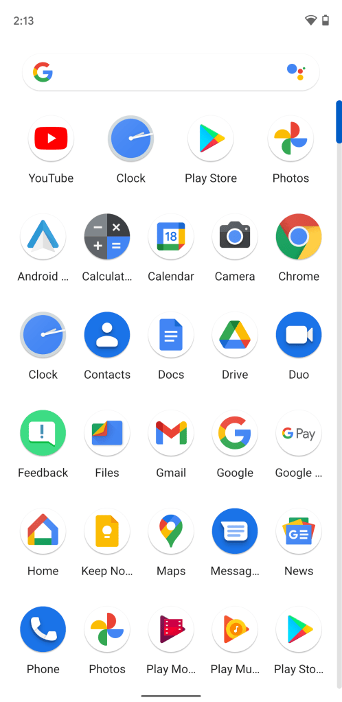
Interestingly, the Pixel Launcher’s new 4×5 grid option has a unique effect on the app drawer, as the suggestion row at the top shrinks down to four apps wide, while the rest of the drawer stays at five apps wide. When using a smaller grid size like 4×4 or 3×3, the app drawer stays at 5 apps wide on all rows.
More on Android 12:
- Here’s everything new in Android 12 Developer Preview 1 [Gallery]
- Android 12 DP1: Privacy toggles can block camera and microphone with a tap
- Android 12 DP1: Pixel 5 readies ‘Double tap’ gesture, doesn’t work yet
- Android 12 DP1: Scrolling screenshots are here, but disabled for now
Author: Kyle Bradshaw
Source: 9TO5Google


