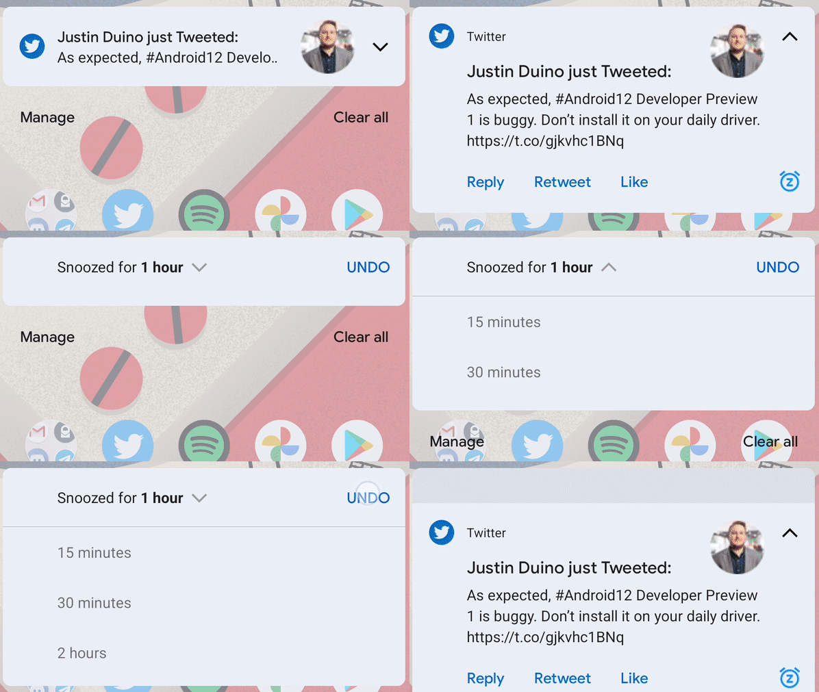
The first developer preview for Android 12 is here! We’re digging through to see what’s new, and as is customary for Google, one of the first things we noticed was yet another tweak to the design of notifications in .
Android updates just don’t go by without some sort of revamp to the notifications shade, and Android 12 is no different. This time around, there are quite a few visual tweaks to notifications instead of functional changes.
The first thing you’ll probably notice is the layout of the notification itself. Google has decided to make the app icon on the leftmost side of the notification considerably larger, especially when the notification is minimized. When expanded, it’s only slightly bigger, but in both cases, it now has an inversed icon. Using Twitter as an example below, the icon has a blue circle with the logo in white. In the case of Twitter, too, the size of the profile picture has become considerably larger compared to what we saw in Android 11 and before. You can see the comparison below with Android 11 on the left and 12 on the right.


In Android 12, Google has also added a dedicated button on notifications that brings up the snooze menu. Snoozing notifications has been around for ages at this point, but it’s always been buried a bit, with an “out of sight out of mind” effect for users. Now, you can just tap the icon, and it immediately snoozes notifications for an hour, a time you can adjust after the fact.

Author: Ben Schoon
Source: 9TO5Google


