
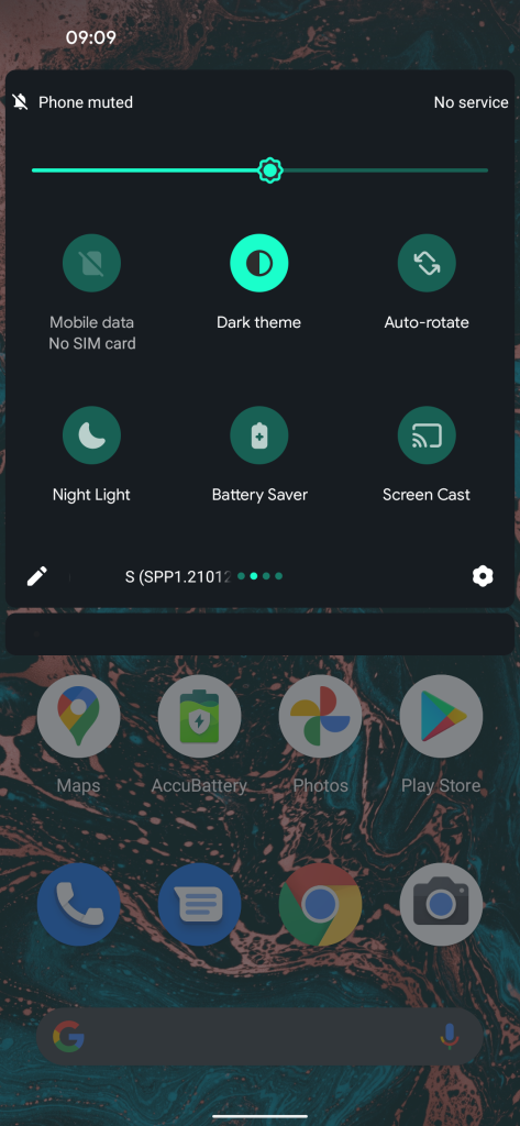
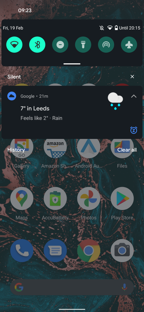
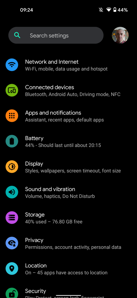
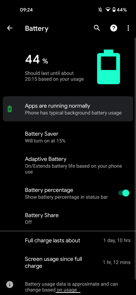
As we’ve been delving further into the first Android 12 Developer Preview, tweaks have been spotted, including to the dark theme on Pixel devices — which is no longer completely or AMOLED black.
Initially spotted by the team over at Android Police, when applied, the dark theme on your Pixel will more closely resemble a dark gray-blue than a pitch or AMOLED black. Now this might be a frustrating tweak if you do prefer the potentially battery-saving pitch-black color scheme that is present on Android 11 and below.
As AP notes, the exact dark theme shade with the Android 12 Developer Preview is #171c21 rather than a pure black color. It’s up to you just how you feel about this change, as some find that pitch black is better than a gray hue, while others simply don’t care. I must admit that I fall into that latter group, it’s not a big deal, but we can understand if it is to you.
-
-
-
-
-
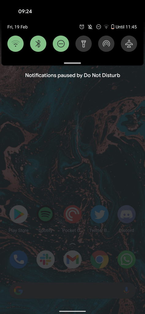
Android 11 -
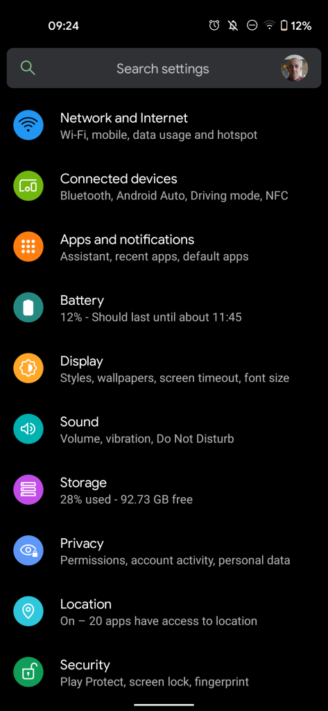
Android 11
Nothing else within the dark theme has changed in Android 12, all of the accent colors you have selected within the Styles & wallpapers section will carry over unchanged. It’s worth noting that the tweak applies to almost all facets of your Pixel device should you sideload the Android 12 Developer Preview. One weird quirk is that areas like the Settings menu and app drawer still retain the pitch-black dark theme in the first Android 12 developer build.
This could simply be evidence of further customization options that we expect from the in-depth theming system that we found evidence of a few weeks ago. We really hope that more options are made available, as we’re sure that to some this potential dark theme change in Android 12 might infuriate quite a few people out there.
- Android 12 Developer Preview 1 hands-on: Top new features [Video]
- Android 12 DP1: ‘Display cutout’ menu now lets you hide Pixel 5, 4a hole punch
- Android 12 DP1: Notifications to gain ‘Automatic’ option for whether or not to alert [Updated]
Author: Damien Wilde
Source: 9TO5Google


