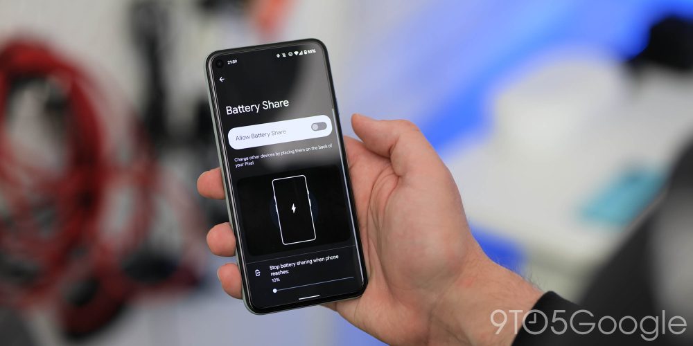
We are potentially just a month or so away from the actual full stable Android 12 release, and that means that the public-facing preview phase is not far off done. Android 12 Beta 4 has arrived some four weeks after the third, and following all of our previous deep dives, we’ve been spending time with it to find the best new features and changes that you can enjoy right now.
You have had it drummed in that Android 12 is going to provide one of the biggest updates to the mobile platform for years. It’s drastically different-looking than you’re probably used to. You might hate it or you might love it, there doesn’t seem to be consensus either way at this stage, but new things often warrant some level of critique.
It feels very much like the releases have been ridiculously thick and fast, we’re only just catching our breath from the first three Android 12 Beta releases, and we now have Beta 4 to contend with. If you have already enrolled, you should soon receive an OTA update that contains the latest August 2021 security patch, plus all of the new UI and system-level tweaks coming with this latest update.
If you haven’t already tried the Android 12 Beta and want to sign up, we have a short little guide to help you get enrolled, but this process is very quick and easy. Basically, head to the Android 12 Beta sign-up page, and you can opt-in — or out — to try the latest pre-release OS build for yourself. That is, provided you have a Pixel 3/3 XL or a newer Made by Google phone.
Video – Android 12 Beta 4 hands-on: top new features!
Subscribe to 9to5Google on YouTube for more videos
Home controls renamed to Device controls
Admittedly minor, the Home controls quick settings toggle is now known as “Device controls.”
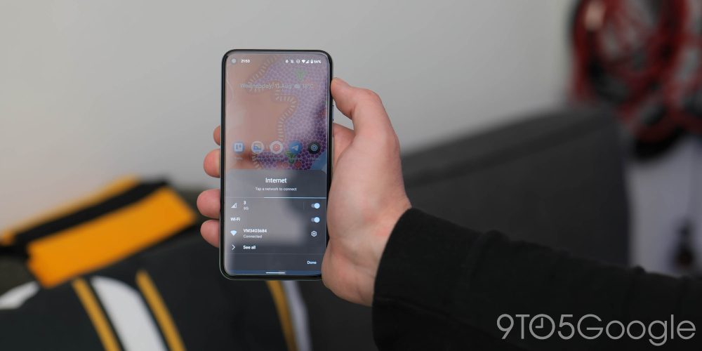
Wi-Fi toggle returns to Internet section
Yes, you can turn off device Wi-Fi from a toggle within the Internet pop-up pane. It’s still not as fast as a long press but it’s better than it was previously.
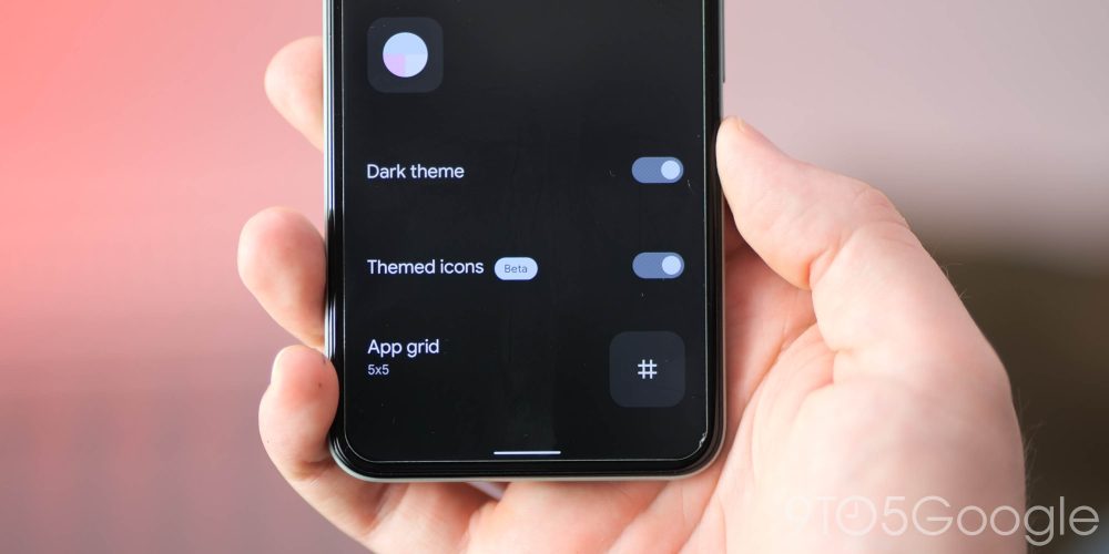
Themed icons now labeled as ‘beta’
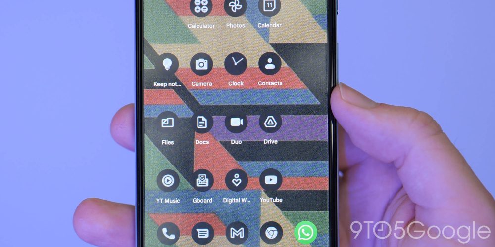
Another very, very small change. Because of the lack of third-party icons, the “Themed icons” option as part of the Pixel Launcher is now labeled as beta.
There are more themed icons that will better follow your system color scheme. Google Tasks is one such new option, with plenty more first-party apps now adhering to this design change.
Settings page makeovers
We saw the Settings pages get a fairly substantial makeover earlier in the Android 12 Beta phase but this was clearly a first-phase change. Almost all pages within Settings now better adapt to your system color as per the Dynamic Color with full-page shifts for icons, image previews and actual section toggles.
Rounded corners are more prominent so as to fit with the rest of the Android 12 aesthetic. On top of this, the dark theme legibility issues are now fixed with this change. When a toggle is activated, a circular accent indicates that you have enabled said setting. It’s clearer and more obvious at a glance — especially when using the system dark theme.
Improved cropping tool when resizing images
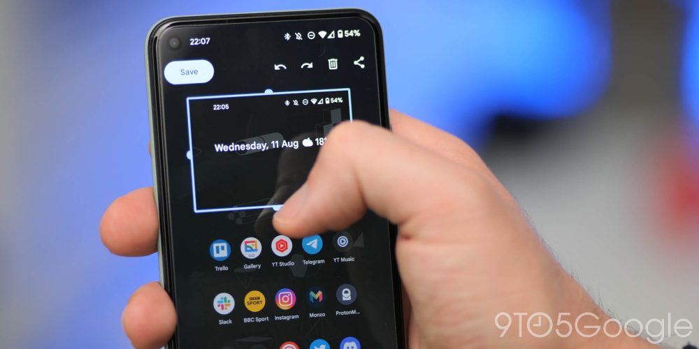
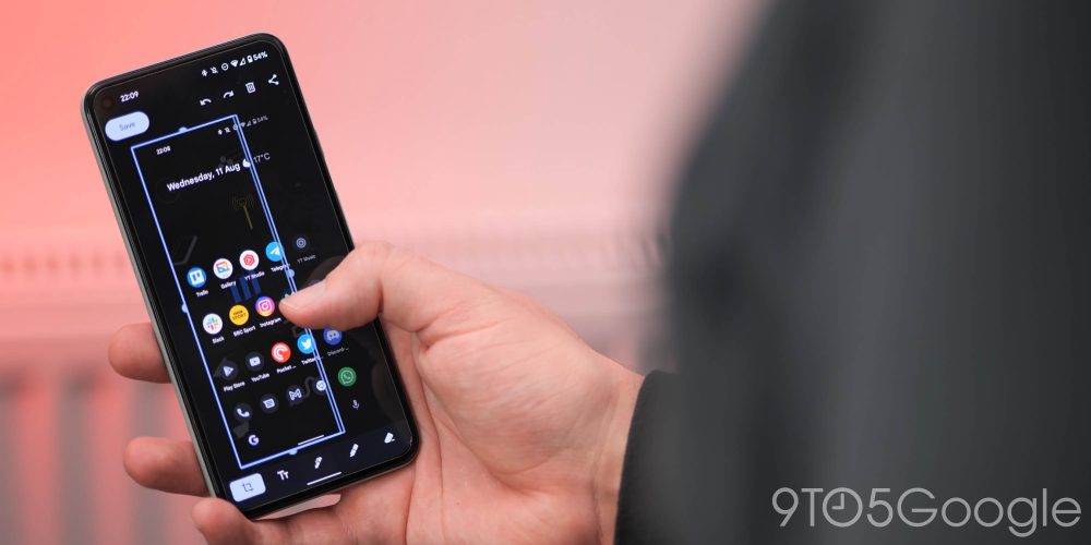
To help you better crop and fine-tune selections when using the markup tool, Android 12 Beta 4 has much more prominent and color appropriate guidelines for greater accuracy. The corner tabs from the previous cropping tool are being ditched in favor of centrally placed circular grip tabs that should be easier to spot and grasp.
Sometimes the corner placed crop tool in previous versions would be harder to get hold of, and so these changes should make it easier to a) spot the outline and b) maneuver and adjust to the right shape and size.
Phone indicator chip in status bar
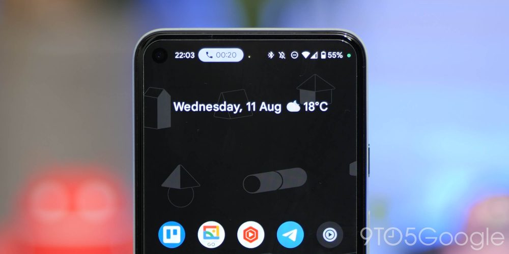
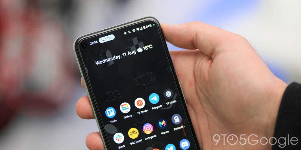
Although not technically a result of the Android 12 Beta 4 update, when making a call using the Google Phone app, alongside the new microphone access indicator you’ll get a small chip to note just how long a phone call has been in progress. Tapping this icon should take you back to the call screen where you can access all of the regular toggles.
Again, not directly linked to Beta 4, but it has arrived just as the latest public preview has dropped and will likely appear around the same time if you are running the Android 12 Beta on your Pixel devices. It’s a neat added extra that makes it even easier to leave the calling screen and use all other areas of your device.
Pixel Launcher gives Google Search widget a Material You makeover
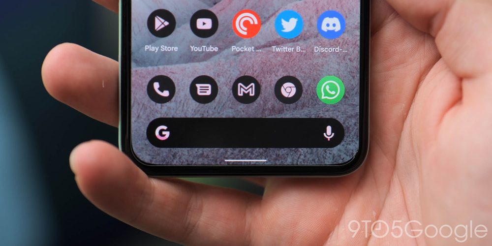
Likely tied to the wider rollout of the Themed icons, if you enable the setting, you’ll get a really nice little added tweak that could be one of the standout new additions. So, when enabled, the Google search bar widget on the Pixel Launcher will be tweaked to fit your system theming.
The result is really subtle but it genuinely looks incredible. Depending on your wallpaper, you can adjust the colors by opening the Wallpaper & style section and select the three core colors that will be used across all areas of Android 12.
Game Dashboard fully usable with in-game quick toggle
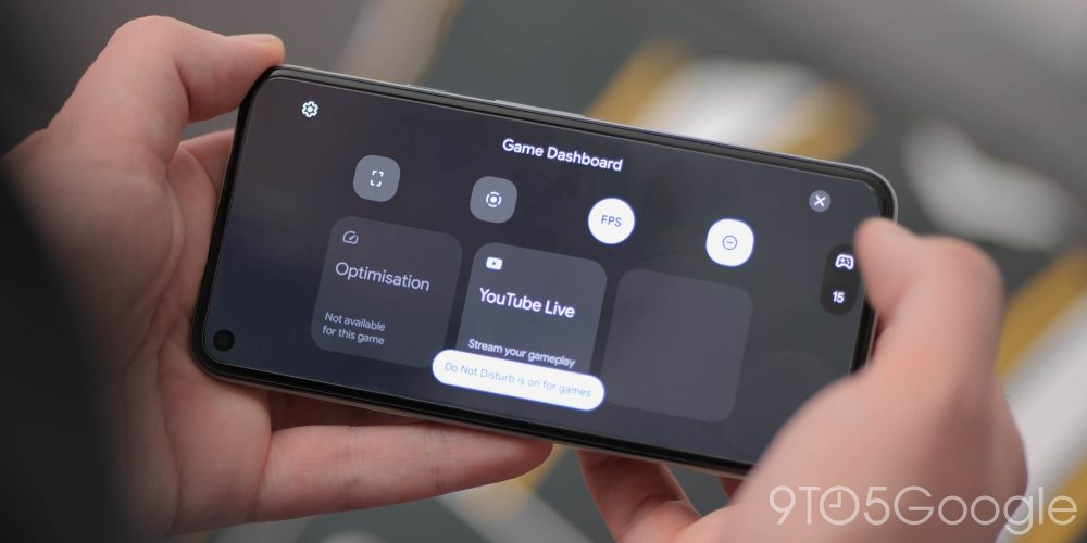
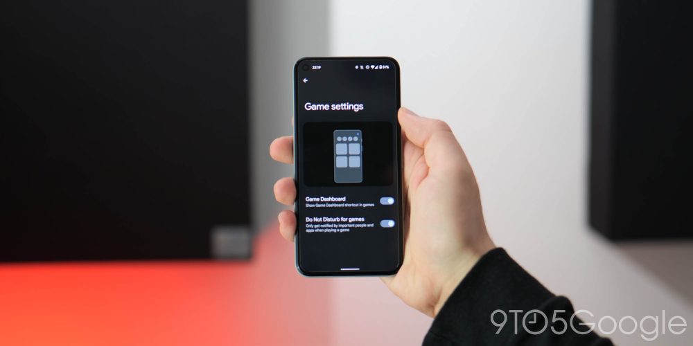
The Game Dashboard is now fully usable when gaming, courtesy of the working in-game quick toggle that grants you direct access to YouTube livestreaming, Do Not Disturb mode, screen recording, screenshots and even the FPS counter.
If you turn on the FPS counter, the floating toggle will show the current screen frame rate so that you can keep an eye on in-game performance. It does fluctuate a substantial amount as games hit loading screens and menus. You also can drag into the four corners of your display — with a little padding inward to try and stay out of the way of on-screen elements and buttons.
Recents menu adds quick image sharing
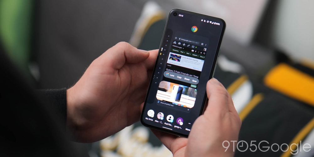
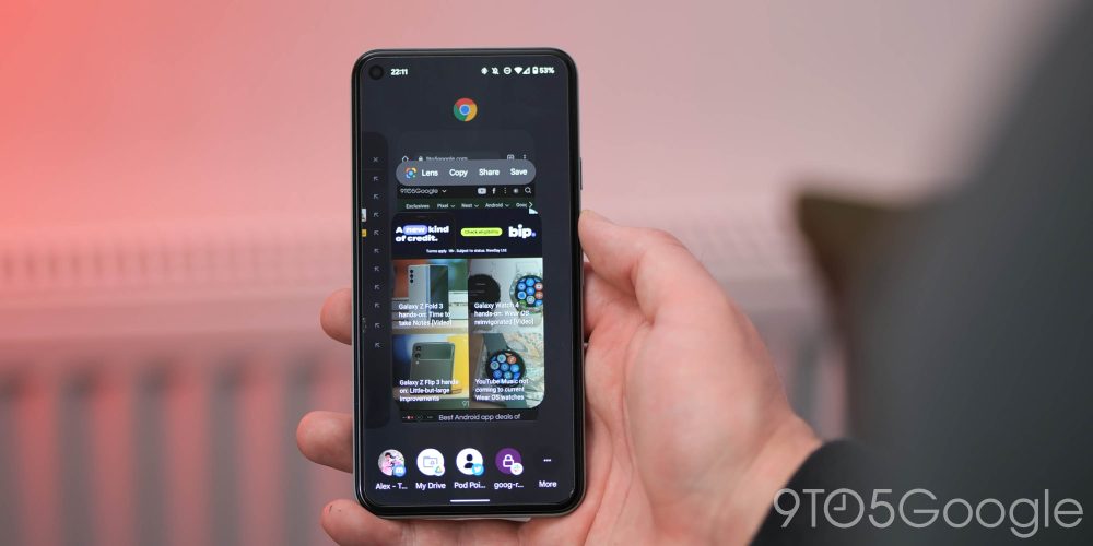
A neat option added that expands upon the existing URL copy option in Android 12 Beta 4 now sees Recents recognize images and similarly mark them with a generic picture target. Tapping elevates and zooms in on the photo with top shortcuts for Lens, Copy, Share, and Save. This toolbar already exists in Android 11, but Google is now better surfacing it to end users.
Meanwhile, you can tap the row of people or drag the image over to a contact icon with the option to expand this to use more apps. Tapping Lens just opens a larger preview of similar images, while you can use the quick share targets to send things in super quick fashion.
Android 12 easter egg goes live!
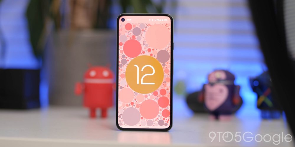
It’s been a long time coming, but we now have the Android 12 easter egg live and ready to play with in Beta 4. Unfortunately, it’s not quite as in-depth as the cat feeding mini-game from Android 11, but Google is showcasing the extent of the Dynamic Colors theming that’s part of the massive Material You overhaul.
You can get to the Android 12 easter egg as you would with any other version by heading to the Settings app, opening “About phone,” then “Android version.” From this page, tap the “Android version” until the easter egg pops up.
This will open to a view of your wallpaper covered by a Material You style clock widget showing the current time. Tap and spin the minute and hour hands and spinning to 12:00 will animate in the Android 12 logo, while the page will then be covered in circles of various sizes all using colors from your current wallpaper, which is one of the hallmarks of the entire Material You design language.
Android 12 Developer Beta 4: What’s your favorite new feature?
Like any release prior, there is quite a lot to unpack in the Android 12 Beta 4 build. In essence, this makes our small selection likely just the tip of the software iceberg. With that said, these are the most prominent user-facing features that we’ve found after delving in.
We expect to see more little things that might slip through the cracks over the coming days and weeks. We have a deeper dive into everything that has been added, including some features that require a little work to get fully operational in our full overview.
What is your favorite new feature, or do you have multiple features that you like? Let us know down in the comments section below!
More on Android 12:
- Android 12 Developer Preview 1 hands-on: Top new features [Video]
- Android 12 Developer Preview 2 hands-on: Top new features [Video]
- Android 12 Developer Preview 3 hands-on: Top new features [Video]
- Android 12 Beta 1 hands-on: Top new features [Video]
- Android 12 Beta 2 hands-on: Top new features [Video]
- Android 12 Beta 3 hands-on: Top new features [Video]
Author: Damien Wilde
Source: 9TO5Google


