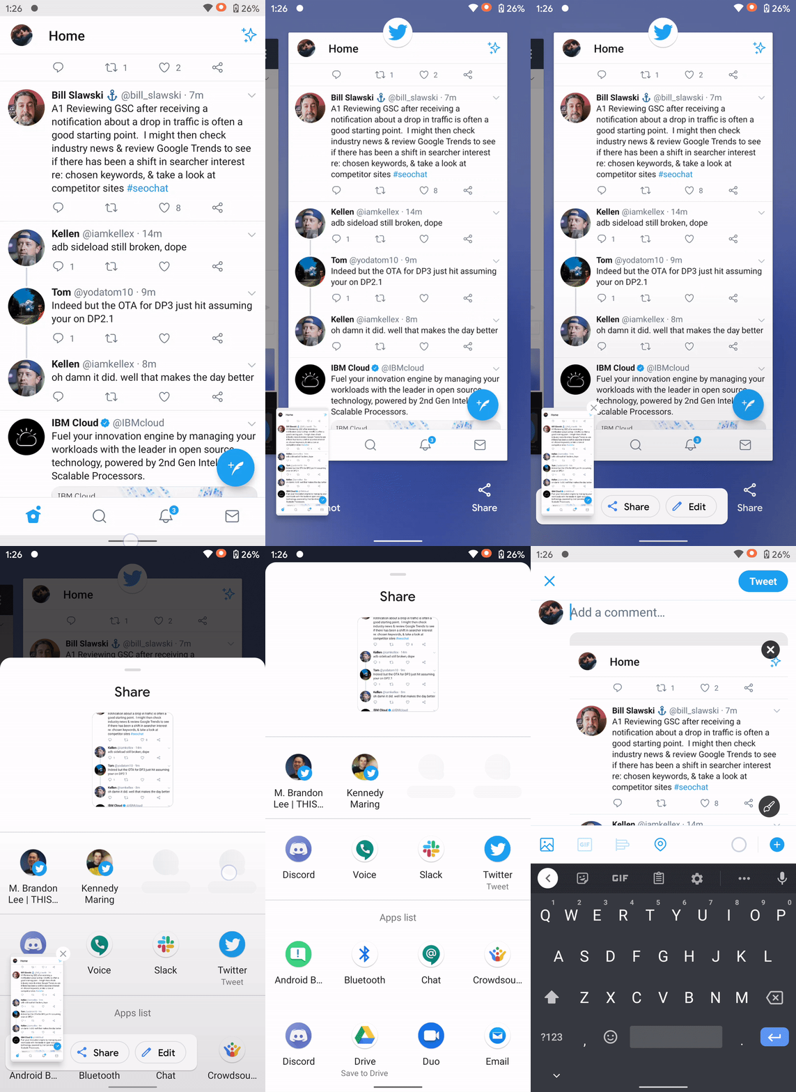
Google is constantly tweaking different aspects of Android in new releases and, now, for Android 11’s third developer preview, the Recents screen has been redesigned with some added functions.
Upon firing up Android 11 DP3 on our Pixel 3a, one of the first changes that were immediately noticeable was the redesigned multitasking or “Recents” screen. The gesture to access is still the same, but Google has now stripped the Pixel’s “smart” row of apps in exchange for bigger app panels and some new buttons at the bottom.
The change in the size of the multitasking panels is pretty minimal, but it’s definitely something that will take some getting used to.
Under the panel, Google has taken advantage of the empty space — previously used on Pixels to include “suggested” apps — with some new function buttons. These buttons include “Screenshot” and “Share.” The first captures a screenshot of the app highlighted in your recents menu while share will take a screenshot and immediately open a share dialog so you can send that image in the app of your choice. These can be seen in action below.

Further, a “select” button also appears on occasion. In Android 11 DP3, though, this button isn’t showing consistently in the Recents menu, making it hard to capture an image. You can see it below, though, as captured by one of our readers.
Stay tuned to 9to5Google and let us know through Twitter or the comments if you see any new changes we haven’t covered!
Author: Ben Schoon.
Source: 9TO5Google


