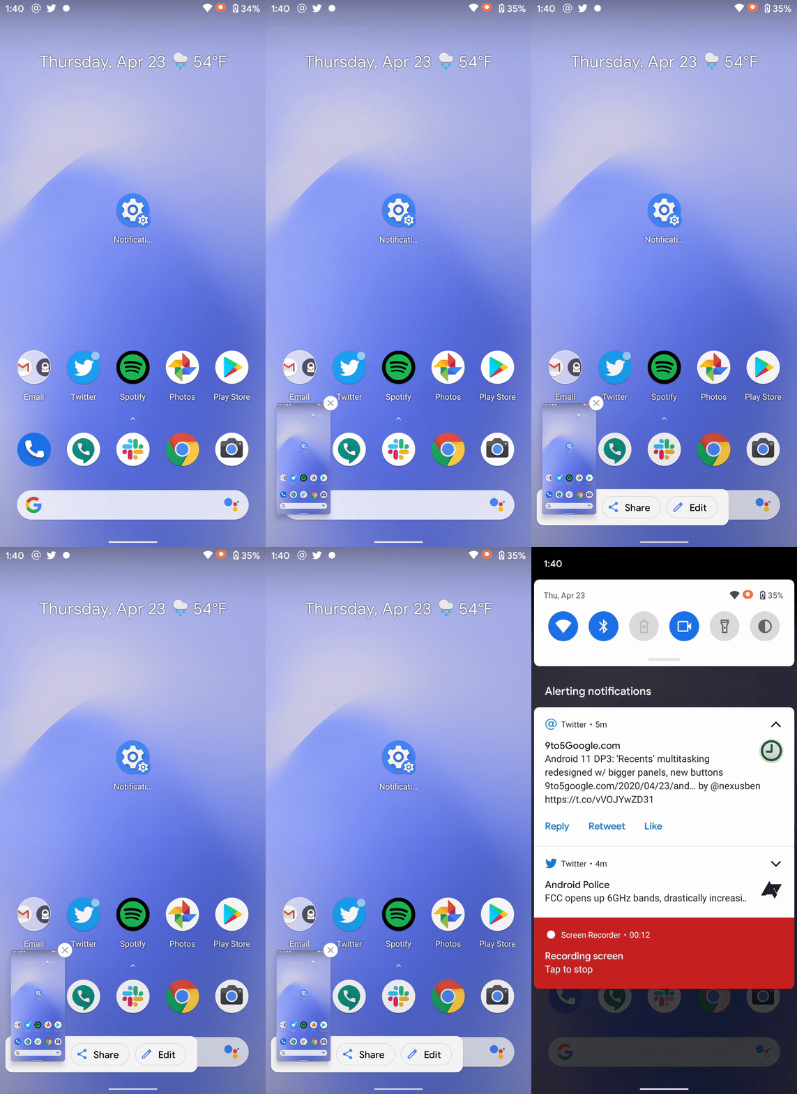
Since the first Android 11 developer preview, we’ve been tracking a new screenshot interface that Google is testing with new options, too. In Android 11 DP3, that new screenshot UI is live but it’s missing one option.
We first spotted this new UI back in the first release of Android 11, but it didn’t start going live for a couple of users until just recently. Now, on Android 11 DP3, the new screenshot UI is live immediately as a part of the system update.
As we originally showed, this updated UI shows the screenshot on the bottom left corner of your device. This is after a brief animation as seen below. Once the screenshot hits the bottom corner, a small “menu” appears to the right of it with options for sharing or editing the screenshot. The entire new interface stays up for a few seconds before fading away.
Notably, the option for a scrolling screenshot is not present with this update yet. Since this was a highly-requested feature, it’s possible Google is saving it for a proper announcement, an announcement that probably been at Google I/O had it not been canceled.

Stay tuned to 9to5Google and let us know through Twitter or the comments if you see any new changes we haven’t covered!
Author: Ben Schoon.
Source: 9TO5Google


