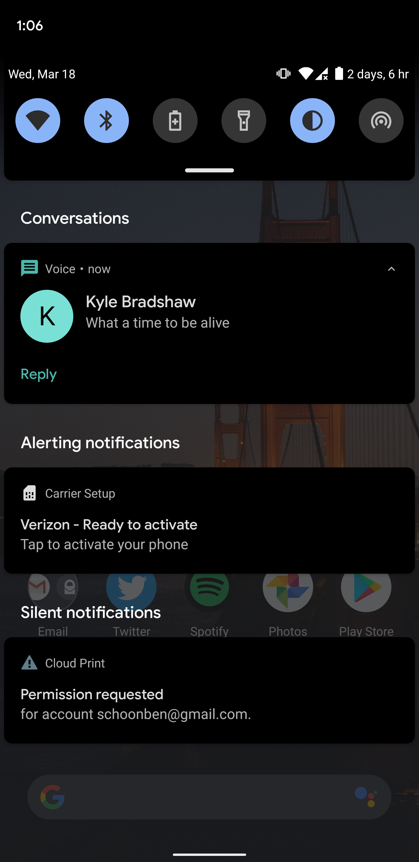
The second developer preview of Android 11 is here and we’re just starting to dig into what it changes, including firstly a more obvious split for different sections of the notification tray.
With Android 11 DP2, there’s now a large visible gap in between the “Conversations,” “Alerting,” and “Silent” sections of your notifications. Previously, Google split these sections with a minimized black bar that contained the text to identify a section.
With this new design, Google is making it more obvious where the notifications are split up. There’s a visible gap in the notifications tray where a new section starts that has the identifying text in larger text than it previously did.
While this new look is much more effective at breaking up the notification sections in Android 11, I think it’s a bit overbearing personally. It wastes space and, depending on your wallpaper, might not look great. Though, it’s possible this is just the start of Google preparing a larger overhaul to the notifications tray for a later Android 11 release. Whatever the case, let us know in the comments your opinion on the change.

More on Android 11:
- How to install the Android 11 Developer Preview on Google Pixel devices [Video]
- Google releases Android 11 DP2 w/ app ‘resume on reboot’ and OTA from DP1
- Android 11 wish list: 10 things we’d love to see in the full release [Video]
Author: Ben Schoon.
Source: 9TO5Google


