![]()
A leading textbook on creative photography, released in 1980, devotes more than 90% of its 460 pages to technical considerations — how cameras and lenses work, darkroom procedures, lighting — and just a few pages to aesthetics and composition.
Reading that textbook today gives new appreciation for just how far we’ve evolved — and how much photography has simplified — in the last few decades.
Typically, photographs are described in terms of the subject matter: landscape, flowers, journalism, fashion, portraits… Or by technical process: large format, platinum print, digital or analog. And photographic education focuses on technical skills (using Photoshop, mastering your DLSR, night photography) and career development (getting jobs, creating portfolios, building a business)—all-important, certainly, but the smallest part of discussion and education is on the photos themselves. We’re left on our own to learn and improve.
I’d like to propose some language and metrics on which anyone can describe and gauge their own photos, and have a more structured means for improvement, comparison and appreciation. Without specifying an absolute place on any scale where “good” might be — it is up to every picture taker to find their comfortable position, but at least we all can be thinking about them on common scales, and have concrete attributes we can explore.
Note: It’s good to keep in mind that these aren’t aesthetic judgments: there are noteworthy, beautiful, amazing photos at every place on these scales.
Things → Moments
I’d generalize by saying “thing” photos tend to be static, and you might be able to take a lot of exploratory images of a thing, getting it right. A product shot would be an extreme case, but an apple, or bird.. you would describe the photo to someone simply by telling them the name of the thing in the picture. Studio photos are almost always of things.

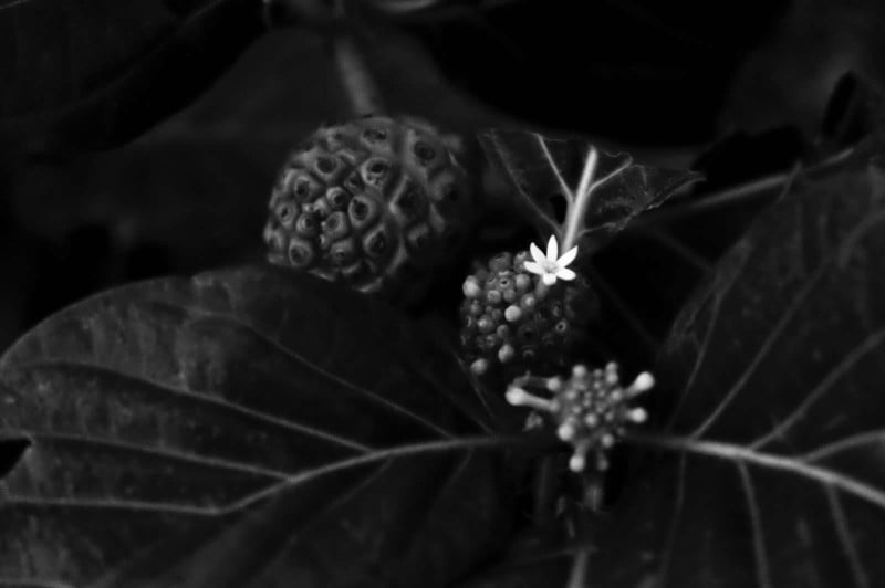
A moment, however, is dynamic. It is what a camera is particularly designed for, to freeze a fleeting moment of time. This might mean motion is somehow conveyed. It might mean that an instant later the scene presented would be meaningfully different. It might mean that no one else ever could have captured this scene, except this photographer at this instant. That’s a moment.
Obviously, all photos are a little of both, but you can feel when an image is more one than the other.
Obvious → Cryptic
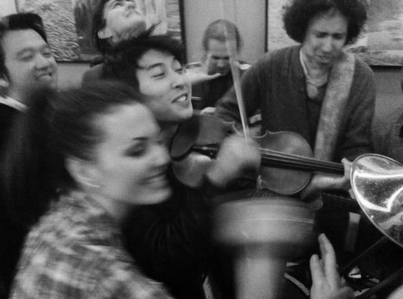
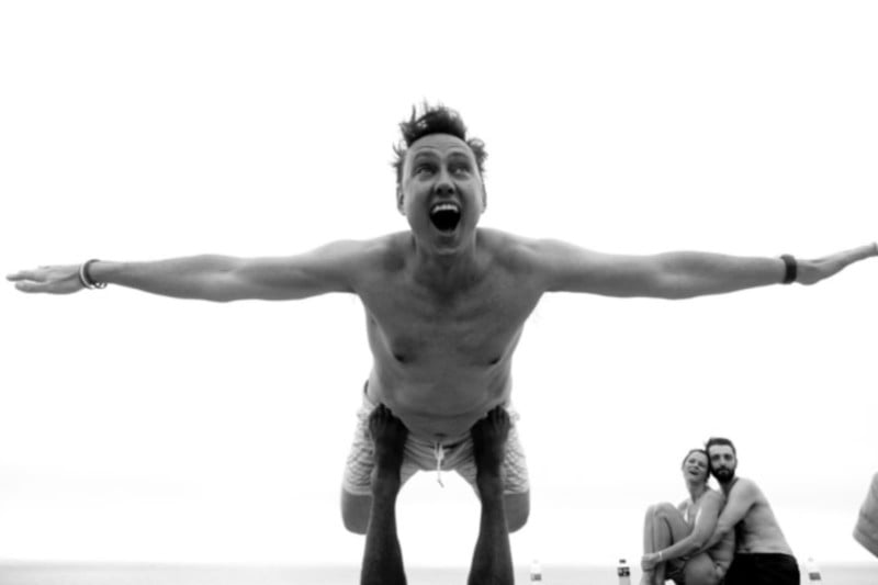
When you look at an image, start an imaginary timer, ticking away as you stare. How long before you know what you’re seeing? Some photos are obvious — “here are the plainly visible and recognizable subjects.” It’s a mug shot. It goes in a catalog. “What a lovely photo of an X.”
Other attributes of the obvious photo are that the subject is often central in the frame or on a neutral background, but neither is necessarily so.
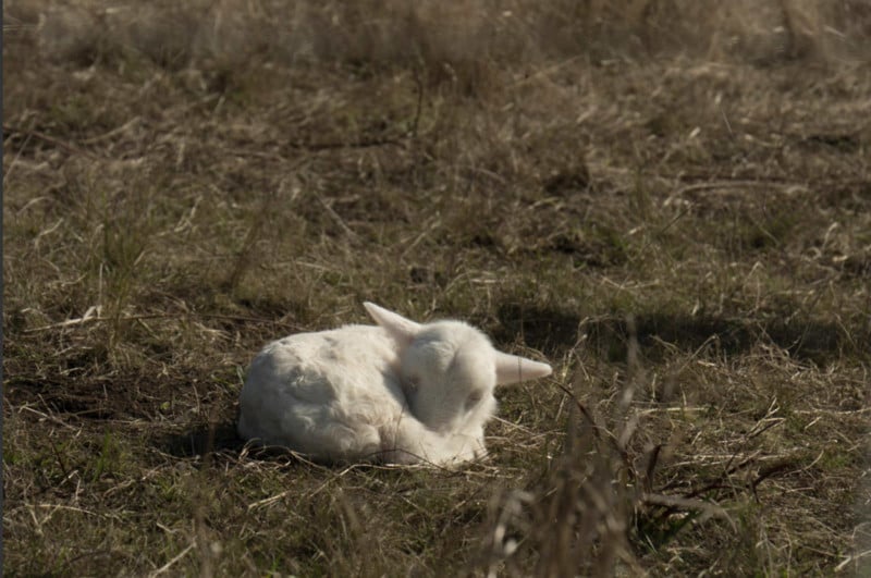
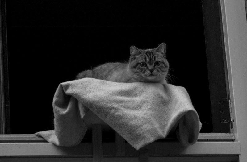
On the other end of the spectrum, the cryptic image is unknowable, or nearly. It’s vague or indistinct or removed from too much context. Sometimes this is used for great effect, almost a Rorschach test; sometimes we imbue meaning when we can’t see it. Cryptic photos might just be textures or shadows. A viewer might say “what is this?” or “I don’t get it.” These images also engage viewers to think, without being told what they should feel or see.
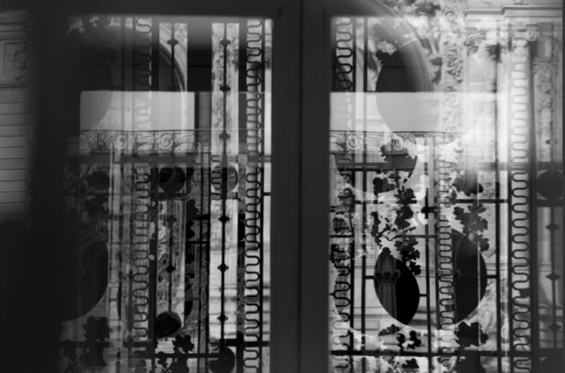
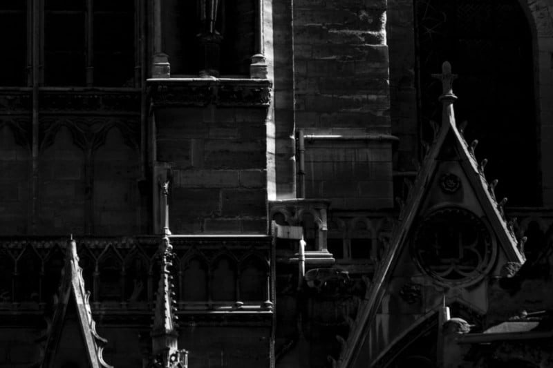
Composition: Formal → Random
Within each photo, there are things that catch our eyes, rhythms and objects and shadows and shapes. When the photographer — either through direct manipulation or sheer luck — snaps a photo, this scene lays itself out in a two-dimensional composition. And when everything in frame feels rigidly and purposely positioned, maybe symmetrical, maybe just “neat”, it’s a more formal composition of elements. “A place for everything, and everything in its place.”
Still, formal compositions can feel dull and lend themselves to being obvious, although not always. And “rules” of composition can make images feel formulaic and unoriginal. Cartier-Bresson’s “decisive moment” speaks to a magical property of structured-but-natural compositions.
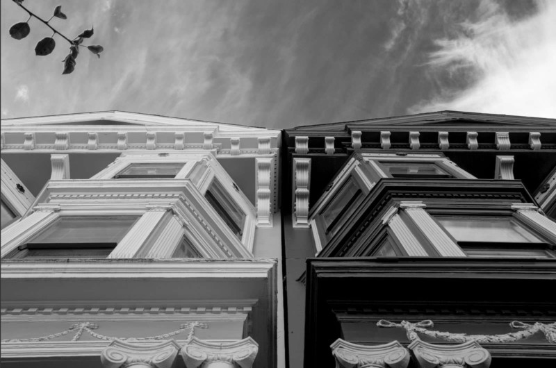
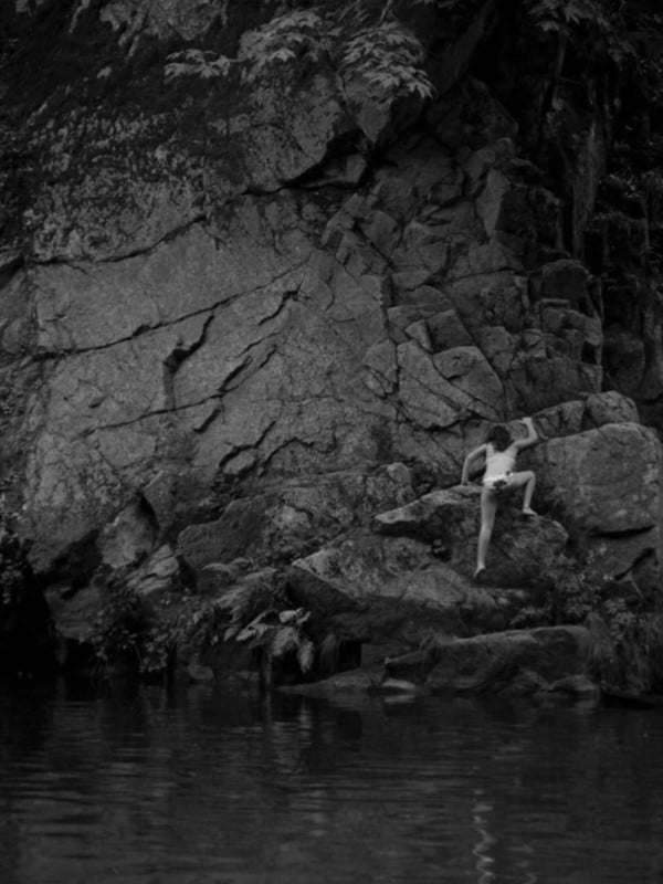
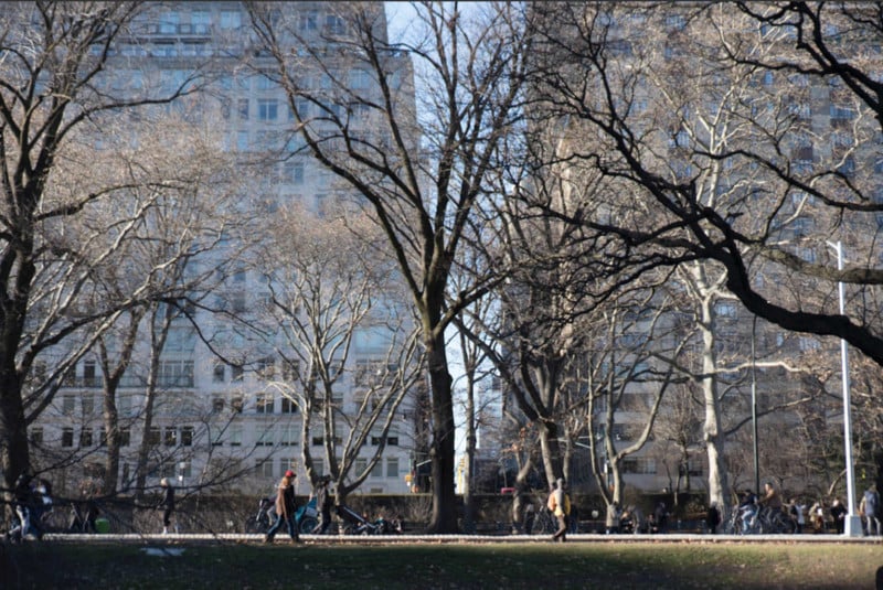
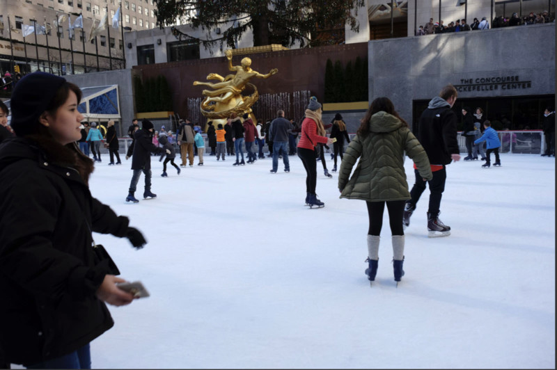
Conversely, if the scene has no sense of being organized, no strong focal points, it can feel random. Almost purposeless. The viewer is not sure where to look. Objects might obscure other objects in awkward ways. Foreground and background elements compete uncomfortably. This can be done with great effect in naturalistic images, but it is also often the hallmark of a novice.
Authentic → Fabricated
All photography is a contrivance, fully conveying anything the photographer wants to express. Edward Weston called photography a “willful distortion of fact.” Paradoxically, a photo can (and frequently does) paint a picture revealing a truth. The truth of a photo is independent of its authenticity. Photographic authenticity, borrowing from the economist Joseph Pine: “is it what it says it is? and is it true to itself?”
To me, this means “is this a real scene, an honest moment, or is it constructed for the photo?” “Is it caught from real life, or conceptualized and executed?” Candid photography feels authentic. Most commercial photography is fabricated.
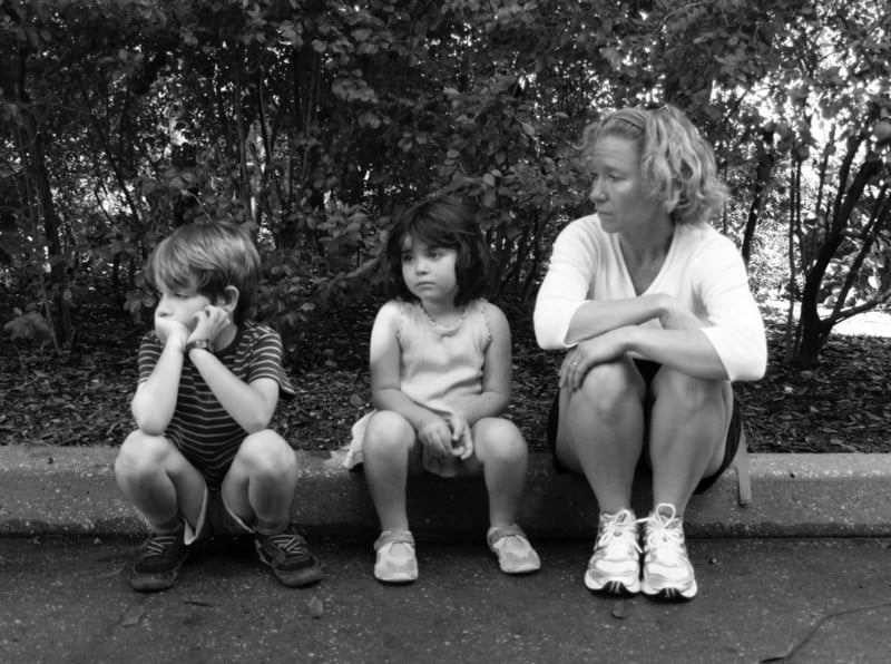
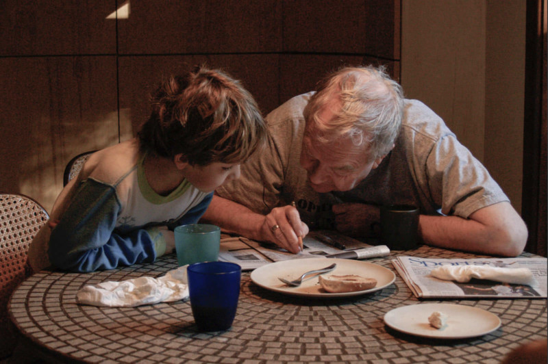
But this is tricky: how much interaction with a subject makes it “fabricated”? Can you turn on a light? Can you move a chair? Can you tell someone to hold still? Do you have to be invisible, so as not to affect the scene whatsoever? Like all these scales, this is not a hard line but a gradient, and everything occupies a place along that continuum.
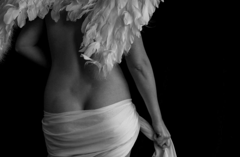
Every photographer will invent their own standard by which one action is okay, but something else is not. Some will invent images out of whole cloth (in Photoshop); others will work in studios with lights and assistants. Some will apply make-up. Some adhere to strict journalistic ethics of distance.
![]()
Just because something is extremely contrived doesn’t mean it’s not communicating truth.
Every photo can be described as a combination of each of these terms. It allows instructors to be concrete in aspects they want to refine, so instead of idiosyncratically describing a photo as “good” or “bad”, they can say “it’s beautiful, but very obvious, maybe too obvious, and too formal a composition — try a more relaxed composition and maybe make it a little more “moment” and a little less “thing.” That’s a very different way to help a student explore picture taking.
About the author: Michael Rubin, formerly of Lucasfilm, Netflix and Adobe, is a photographer and host of the podcast “Everyday Photography, Every Day.” The opinions expressed in this article are solely those of the author. To see more from Rubin, visit Neomodern or give him a follow on Instagram. This article was also published here.
Image credits: All images copyright © 2021 MH Rubin
Author: Michael Rubin
Source: Petapixel


